Landing pages serve as digital gateways that can transform fleeting visitor interest into measurable business outcomes. In today’s competitive online landscape, the difference between a converting page and one that drives visitors away often lies in strategic design decisions that prioritise message clarity and user psychology. Modern consumers form judgements within milliseconds of arrival, making every design element crucial for success. The most effective landing pages combine scientific principles of user behaviour with persuasive design techniques to create experiences that feel both intuitive and compelling. Understanding how visitors process visual information, combined with strategic message delivery, forms the foundation of high-converting pages that consistently deliver results.
Conversion-centred design principles for landing page architecture
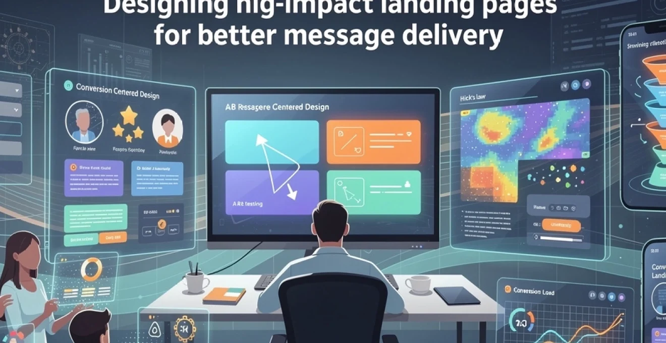
Effective landing page architecture begins with understanding how visitors naturally interact with digital content. Research indicates that users spend approximately 2.6 seconds focusing on the first area that draws their attention, making initial visual impact absolutely critical. Successful conversion-centred design creates a clear visual hierarchy that guides visitors through a predetermined journey, eliminating confusion and reducing friction at every touchpoint.
Above-the-fold optimisation using the Attention-Interest-Desire-Action framework
The AIDA framework provides a psychological roadmap for structuring above-the-fold content that captures and converts visitor attention. Attention elements include compelling headlines that immediately communicate value, whilst Interest components utilise supporting visuals and benefit-focused subheadings. The Desire phase incorporates social proof elements and benefit statements that create emotional connection, leading naturally to the Action phase represented by strategically positioned call-to-action buttons.
Above-the-fold optimisation requires careful consideration of screen real estate allocation. Studies demonstrate that 80% of visitor attention focuses on content visible without scrolling, making this space invaluable for message delivery. Effective implementation involves positioning the most critical conversion elements within the initial viewport whilst maintaining visual balance that doesn’t overwhelm visitors with too much information simultaneously.
F-pattern and Z-Pattern visual hierarchy implementation
Eye-tracking studies reveal distinct patterns in how users scan webpage content, with F-patterns dominating text-heavy pages and Z-patterns occurring on more visual layouts. The F-pattern shows users reading horizontally across the top, then scanning down the left side before making another horizontal sweep. This behaviour suggests placing crucial conversion elements along these natural scanning paths to maximise visibility and engagement.
Z-pattern implementation works particularly well for landing pages with minimal text and strong visual elements. This pattern follows the natural reading flow from top-left to top-right, then diagonally down to bottom-left before finishing at bottom-right. Strategic placement of headlines, images, benefits, and call-to-action buttons along this invisible Z-line creates seamless visual flow that guides visitors towards conversion naturally.
Cognitive load reduction through progressive information disclosure
Progressive information disclosure prevents overwhelming visitors by presenting information in digestible chunks that build understanding gradually. This approach recognises that human cognitive processing has limitations, with most people able to retain only 7±2 pieces of information simultaneously. Effective implementation involves presenting core value propositions immediately, followed by supporting details that reinforce the initial message without creating information overload.
Successful progressive disclosure utilises visual techniques such as accordion sections, tabbed content, and strategic use of white space to create breathing room between information blocks. This methodology allows visitors to consume information at their preferred pace whilst ensuring that essential conversion elements remain prominently displayed. The technique proves particularly valuable for complex products or services that require detailed explanation to drive purchasing decisions.
Hick’s law application in navigation simplification
Hick’s Law demonstrates that decision-making time increases logarithmically with the number of available options. For landing pages, this principle suggests that reducing choices accelerates visitor decision-making and improves conversion rates. Implementation involves eliminating unnecessary navigation elements, limiting form fields to essentials, and presenting single, clear calls-to-action rather than multiple competing options.
Practical application of Hick’s Law extends beyond simple choice reduction to include visual simplification that reduces cognitive processing requirements. This involves using consistent design patterns, limiting colour palettes to 2-3 primary colours, and maintaining uniform spacing throughout the page.
This strategic restraint helps visitors focus on what truly matters rather than wasting mental energy on secondary options. When you remove top navigation, sidebars, and competing promotional blocks from a landing page, you implicitly answer the visitor’s main question: “What should I do next?” A simplified interface aligned with Hick’s Law creates a direct path from initial curiosity to meaningful action, significantly improving the conversion potential of every visit.
Persuasive copywriting strategies for message amplification
Whilst layout and structure determine how visitors move through a landing page, copy determines why they should care enough to continue. Persuasive copywriting acts as the connective tissue between your offer and your audience’s motivations, transforming static design into a dynamic conversation. High-impact landing pages use language that mirrors the visitor’s own words, addresses their anxieties, and frames the offer as a logical next step rather than a hard sell.
Effective message amplification relies on clarity before creativity. Overly clever headlines that obscure the value proposition often reduce conversions, even if they seem engaging at first glance. By grounding your copy in proven frameworks and behavioural psychology, you can craft landing page messages that feel both emotionally resonant and logically compelling, helping visitors move from awareness to commitment with minimal friction.
Emotional trigger integration using the PAS formula
The PAS formula—Problem, Agitation, Solution—remains one of the most reliable frameworks for crafting persuasive landing page copy. It begins by clearly articulating the visitor’s primary problem in their own language, demonstrating that you understand their situation. The Agitation stage then explores the consequences of inaction, subtly amplifying emotional tension without resorting to fearmongering.
Finally, the Solution step positions your product, service, or resource as the natural resolution to this tension. When used above the fold, PAS can quickly align your landing page message with visitor intent, especially for high-intent traffic from paid search or targeted email campaigns. For example, a software landing page might highlight wasted hours on manual reporting (Problem), emphasise the ongoing stress and missed opportunities (Agitation), then present automated dashboards as the seamless Solution.
Integrating emotional triggers via PAS is most effective when you balance empathy with specificity. Rather than using generic pain points, reference concrete scenarios, metrics, or day-to-day frustrations your audience recognises instantly. Think of PAS as a bridge: on one side stands your visitor’s current reality, on the other stands your offer; your copy’s role is to make crossing that bridge feel safe, urgent, and worthwhile.
Social proof implementation through customer testimonials and trust badges
Social proof reduces perceived risk by showing visitors that others like them have already taken the same action and benefited. On conversion-focused landing pages, this often takes the form of testimonials, case studies, star ratings, and trust badges from recognised brands or security providers. When placed strategically near call-to-action areas, social proof elements can increase conversion rates by reassuring visitors at the exact moment they are deciding whether to commit.
High-performing testimonials are specific, outcome-focused, and attributed to real people with identifiable roles and companies. A statement such as “We increased qualified leads by 42% in three months” carries far more weight than vague praise. Including headshots, job titles, and company logos further enhances credibility and helps visitors see themselves in the success story. In many industries, testimonials act as a proxy for word-of-mouth, turning your landing page into a digital showroom of real-world results.
Trust badges and certification logos operate on a similar psychological principle. Security seals, industry awards, and well-known client logos trigger instant recognition and reduce anxiety—particularly on pages that request sensitive information or payment details. You don’t need to overwhelm the layout with badges; a small cluster near form fields or the checkout button can be enough to tip hesitant visitors towards action.
Scarcity and urgency psychology in call-to-action messaging
Scarcity and urgency tap into the fear of missing out, encouraging visitors to act sooner rather than “come back later”—a moment that rarely arrives. When used ethically, these principles can significantly enhance call-to-action effectiveness by framing your offer as time-bound or limited in availability. Common examples include countdown timers for promotions, limited seat indicators for webinars, or caps on the number of available consultations per month.
The key is authenticity. Artificial urgency, such as endlessly resetting timers, quickly erodes trust and can harm long-term brand perception. Instead, align urgency with genuine constraints: limited inventory, scheduled event dates, or capacity-based services. Clear, transparent messaging such as “Only 5 spots left for this cohort” or “Offer ends at midnight on Friday” gives visitors enough information to make an informed yet time-sensitive decision.
From a design perspective, urgency messaging should sit close to your primary call-to-action and remain visually distinct without overwhelming the page. Think of it as a subtle nudge rather than an alarm. When combined with benefit-driven button copy—such as “Secure Your Spot” or “Claim My Free Audit Today”—you create a compelling psychological incentive that reduces procrastination and boosts immediate engagement.
Value proposition canvas methodology for benefit communication
Many landing pages underperform not because the offer is weak, but because the value is poorly articulated. The Value Proposition Canvas provides a structured way to map your audience’s jobs, pains, and gains against your product’s features, pain relievers, and gain creators. This framework ensures your landing page copy speaks directly to what visitors are trying to achieve, rather than what you are excited to promote.
In practice, this means translating internal product language into external benefit language. Instead of highlighting “advanced automation rules,” you might emphasise “save up to 10 hours a week by automating repetitive tasks.” Each headline, subheading, and bullet point should answer a variation of the question: “How does this help me achieve my goals faster, easier, or with less risk?” When your landing page mirrors the structure of the Value Proposition Canvas, every section reinforces a clear user-centric narrative.
Using this methodology also helps you prioritise which benefits to feature above the fold and which to reserve for deeper sections of the page. High-impact, high-relevance gains deserve top visibility, while more niche advantages can appear lower down for visitors seeking detailed information. Over time, you can refine your value messaging using test results and customer feedback, gradually aligning your landing page promise with the outcomes your best customers actually experience.
User experience optimisation through data-driven testing
Even the most carefully planned landing page is ultimately a hypothesis about what will resonate with your audience. Data-driven testing transforms that hypothesis into a continuous optimisation cycle, allowing you to refine design, copy, and user flows based on real behaviour rather than assumptions. Instead of relying on opinion or internal preference, you use measurable evidence to determine which variations deliver the strongest conversion rates.
A robust testing strategy combines quantitative analytics with qualitative insights, ensuring you understand not only what visitors do on your page but also why they behave that way. Over time, this process turns your landing page into a living asset that evolves alongside audience expectations, campaign objectives, and market conditions. The result is a systematically improved user experience that supports clearer message delivery and more consistent business outcomes.
A/B testing protocols using google optimize and optimizely
A/B testing remains the foundation of data-driven landing page optimisation. By serving two or more variants of a page element—such as a headline, hero image, or call-to-action button—to different segments of your traffic, you can observe which version produces higher conversion rates. Tools like Google Optimize and Optimizely make it possible to run these experiments without extensive development work, using visual editors and clear reporting dashboards.
Effective A/B testing starts with a well-defined hypothesis grounded in observed behaviour or performance gaps. For example, if analytics show a high drop-off rate above the fold, you might hypothesise that the current headline lacks clarity and test a more benefit-focused alternative. Tests should run long enough to achieve statistical significance, typically at least one to two weeks depending on traffic volume, to avoid drawing conclusions from random fluctuations.
To prevent diluted insights, it’s best to focus on one primary variable at a time and avoid stacking multiple major changes into a single test. Over time, incremental improvements compound: a few percentage points gained across headlines, forms, and layouts can collectively produce substantial lifts in overall conversion rates. By documenting each test—hypothesis, setup, outcome—you build an institutional knowledge base that informs future landing page strategies.
Heatmap analysis with hotjar for user behaviour insights
While A/B testing reveals which variations perform better, it does not always explain why visitors behave a certain way. Heatmap tools such as Hotjar and similar platforms visualise user interactions, showing where people click, how far they scroll, and which areas attract the most or least attention. These visual overlays provide an intuitive way to diagnose friction points and identify underperforming sections of your landing page.
For instance, a scroll heatmap might reveal that only 30% of visitors reach your primary call-to-action because it sits too low on the page. Click maps may show that users repeatedly click on non-interactive elements, signalling confusion or unmet expectations. By reviewing these patterns, you can adjust layout, move important content higher, or transform frequently clicked content into functional buttons or links.
Think of heatmaps as the equivalent of watching customers move through a physical store. You see where they pause, which displays they ignore, and where bottlenecks occur. Combined with session recordings—short replays of individual user visits—you gain a nuanced understanding of how people experience your landing page, allowing you to refine both message placement and interaction design for greater clarity and impact.
Conversion funnel tracking via google analytics enhanced ecommerce
To optimise landing page performance at scale, you need visibility into every step of the user journey, not just the final conversion. Google Analytics, particularly with Enhanced Ecommerce or event-based tracking, allows you to construct detailed conversion funnels that highlight where visitors drop off. By mapping each key action—form view, field interaction, button click, confirmation—you can pinpoint precisely where friction occurs.
For example, you may discover that a high percentage of visitors click the “Get Started” button but abandon the process on the second form step. This insight suggests that the issue lies not in your hero messaging but in the complexity or perceived risk of your form. Armed with this information, you can test shorter forms, progress indicators, or clearer privacy assurances and measure the downstream impact on completed conversions.
Funnel tracking also enables you to segment performance by traffic source, device type, or campaign, revealing which combinations produce the highest-quality visitors. Such insights are invaluable when allocating advertising budgets or tailoring landing page variations to specific audiences. Over time, consistent funnel analysis turns your landing pages from static campaign assets into finely tuned engines for predictable growth.
Multivariate testing for complex element combinations
While A/B testing focuses on changing one primary variable at a time, multivariate testing (MVT) explores how multiple elements interact with each other. This approach is particularly useful for high-traffic landing pages where headline, imagery, and call-to-action variations may influence performance in combination rather than isolation. MVT tools algorithmically rotate different combinations to determine which configuration performs best overall.
Because multivariate testing requires substantially more traffic to reach statistical significance, it is best reserved for pages with large visitor volumes or critical revenue impact. When executed properly, it can reveal surprising synergies—for instance, a particular hero image may perform best only when paired with a specific benefit-driven headline and a contrasting call-to-action colour. These insights would be difficult to uncover with sequential A/B tests alone.
To keep multivariate experiments manageable, limit the number of elements and variations you test simultaneously. Treat MVT as an advanced optimisation layer once you have already validated core hypotheses with simpler tests. Used strategically, it allows you to fine-tune high-converting landing pages into exceptional ones by discovering the most effective combination of messaging and design elements.
Technical performance enhancement for message retention
No matter how compelling your content or persuasive your offer, technical friction can sabotage your landing page before your message has a chance to land. Slow load times, layout shifts, and intrusive errors erode trust and increase bounce rates, especially on mobile connections. Recent studies indicate that when page load time increases from one to three seconds, the probability of a bounce rises by over 30%, underscoring how performance directly affects conversion potential.
Optimising technical performance is therefore not just an IT concern but a core component of conversion-centred design. Techniques such as image compression, caching, code minification, and content delivery networks (CDNs) help ensure that visitors see your key messages and calls-to-action as quickly and smoothly as possible. Aligning with modern performance metrics like Google’s Core Web Vitals—Largest Contentful Paint (LCP), First Input Delay (FID), and Cumulative Layout Shift (CLS)—provides a practical framework for prioritising improvements.
From a message delivery standpoint, it’s especially important that above-the-fold content loads first and remains stable. If headlines or primary buttons shift position as the page loads, visitors may misclick or assume the site is unreliable. Think of performance optimisation as the infrastructure that supports your persuasive storytelling: without a stable, fast foundation, even the best-crafted landing page copy and design will struggle to achieve their full impact.
Mobile-first responsive design implementation
With mobile devices now accounting for well over half of global web traffic, designing landing pages primarily for desktop users is no longer viable. A mobile-first approach assumes that many visitors will first encounter your message on smaller screens, often in distracting environments and on variable connections. This context demands streamlined layouts, larger tap targets, and concise messaging that can be absorbed quickly without excessive zooming or scrolling.
Mobile-first landing page design starts by defining the essential elements that must appear in the initial viewport: a clear headline, succinct value proposition, and prominent call-to-action. Additional details, supporting visuals, and secondary content can then be progressively layered in as screen size increases. By designing from the smallest screen upwards, you ensure that every pixel serves a purpose and that non-essential elements do not crowd out the core message.
Responsive implementation also requires careful attention to typography, spacing, and interaction patterns. Buttons should be comfortably tappable with a thumb, form fields should use appropriate input types for faster completion, and any hover-dependent functionality must have mobile-friendly equivalents. When executed well, a mobile-first responsive strategy turns your landing page into a flexible canvas that delivers consistent message clarity across devices, rather than a desktop experience awkwardly compressed onto a phone.
Landing page psychology and behavioural design patterns
At its core, a landing page is an attempt to influence human behaviour: to prompt a sign-up, a purchase, a download, or a request for more information. Behavioural design patterns translate psychological principles into repeatable interface solutions that support these goals without feeling manipulative. By understanding how biases such as loss aversion, anchoring, and commitment consistency shape decision-making, you can craft landing pages that feel intuitive and aligned with natural human tendencies.
For example, presenting a higher-priced “anchor” package alongside a recommended mid-tier option can make the latter seem more reasonable, even if its absolute cost remains the same. Similarly, breaking complex actions into smaller, clearly labelled steps reduces perceived effort and increases the likelihood of completion. Microcopy that reassures visitors—such as “You can cancel anytime” or “No credit card required for the free trial”—addresses subconscious objections before they derail the conversion journey.
Ethical behavioural design prioritises long-term trust over short-term gains. Rather than relying on dark patterns that trick users into unwanted commitments, high-impact landing pages use transparent messaging and supportive cues to help visitors make decisions that genuinely serve their interests. When your design patterns respect user autonomy while guiding them towards valuable outcomes, you not only improve conversion rates but also lay the groundwork for stronger, more sustainable customer relationships.