The digital landscape has undergone a seismic shift in recent years, with mobile devices becoming the primary gateway for digital interaction. Statistics reveal that over 70% of internet users now depend exclusively on mobile devices for online access, while 40% of consumers aged 18-34 in the United States have no alternative means of accessing digital content beyond their smartphones. This transformation demands a fundamental reimagining of how organisations approach communication strategy, moving beyond simple responsive design to embrace truly mobile-centric thinking.
Mobile-first communication represents more than just adapting existing content for smaller screens. It requires understanding that mobile users exhibit distinct behavioural patterns, consumption habits, and engagement expectations compared to desktop users. The urgency of this shift is underscored by the fact that 96% of consumers now own smartphones, with mobile phones becoming the preferred platform for browsing shopping websites, conducting online searches, banking, and entertainment consumption.
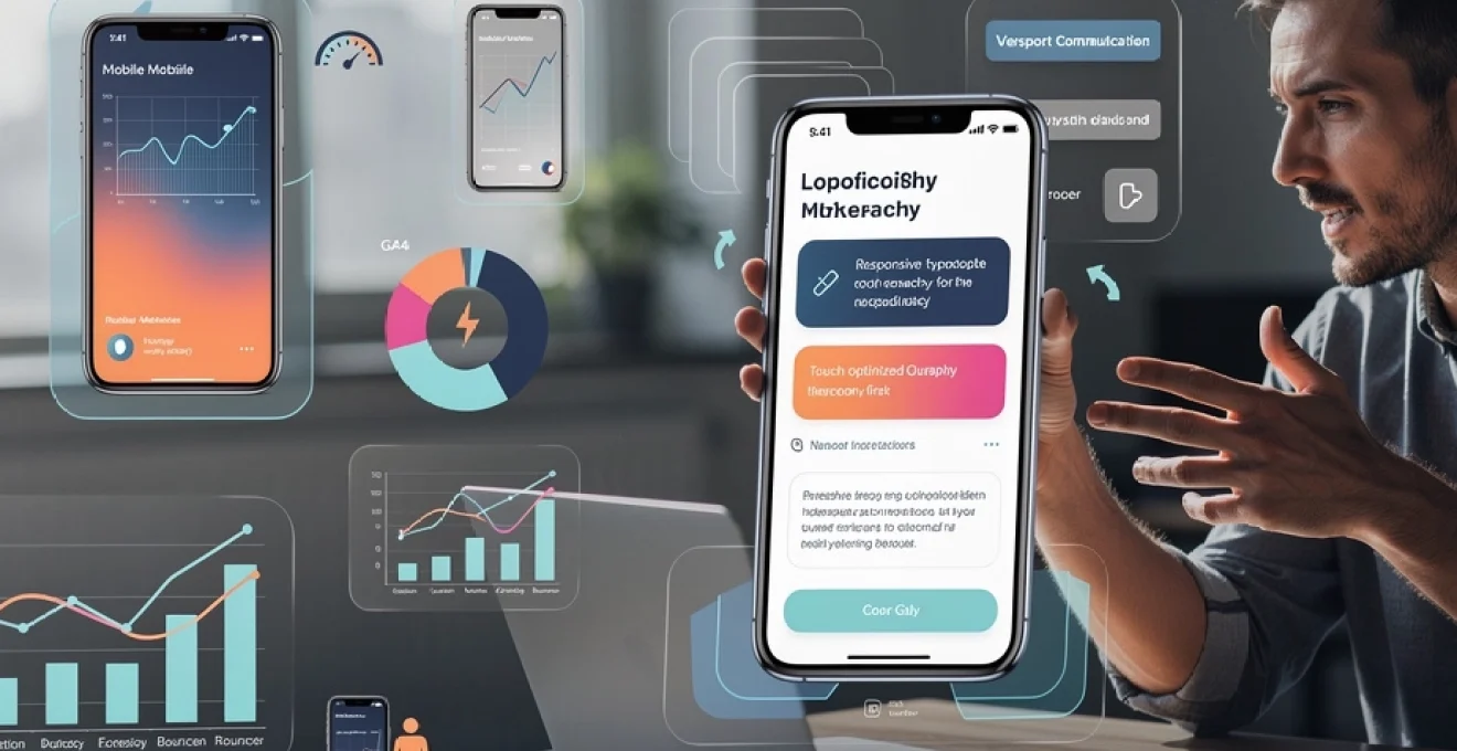
Mobile-first communication strategy fundamentally restructures how brands connect with their audiences, prioritising speed, simplicity, and seamless user experiences across all touchpoints. The implications extend far beyond web design, encompassing content strategy, user interface design, performance optimisation, and comprehensive accessibility considerations that ensure inclusive communication reaches every member of the target audience.
Mobile-first design principles for communication strategy development
Developing a robust mobile-first communication strategy requires adherence to specific design principles that acknowledge the unique constraints and opportunities presented by mobile devices. These principles serve as the foundation for creating experiences that not only function effectively on smartphones but genuinely enhance user engagement and satisfaction levels.
Responsive typography hierarchy and readability standards
Typography forms the backbone of mobile communication, yet many organisations underestimate its impact on user engagement and comprehension rates. Responsive typography goes beyond simple font scaling, incorporating sophisticated hierarchy systems that guide users through content efficiently. Research indicates that mobile users scan content in distinct patterns, making typography choices critical for information retention.
Optimal mobile typography requires careful consideration of font sizes, with body text typically ranging between 16-18 pixels to ensure readability without zooming. Heading structures must create clear visual separation, with H2 tags typically 1.5-2 times larger than body text and H3 tags maintaining proportional relationships. Line spacing should increase to 1.4-1.6 times the font size to accommodate finger-based navigation and reduce visual strain during extended reading sessions.
Font selection significantly impacts loading performance and user experience quality. System fonts such as San Francisco for iOS and Roboto for Android provide optimal rendering while reducing bandwidth requirements. Custom fonts, while offering brand differentiation, must be carefully optimised using font-display: swap properties and subset loading to prevent layout shifts that disrupt user experience.
Touch-optimised interface elements and interaction patterns
Mobile interface design must accommodate the fundamental differences between cursor-based and touch-based interaction models. Touch targets require minimum dimensions of 44×44 pixels to ensure accurate selection, with spacing of at least 8 pixels between interactive elements to prevent accidental activation. This consideration extends beyond buttons to include all clickable elements such as links, form fields, and navigation items.
Gesture-based navigation patterns have become integral to mobile user expectations, with swipe, pinch, and tap gestures forming the foundation of intuitive interaction design. Progressive web applications benefit from implementing native-like gestures that reduce cognitive load and create familiar interaction patterns. Pull-to-refresh functionality, swipe navigation between content sections, and long-press context menus enhance user engagement while maintaining accessibility standards.
Interface feedback mechanisms play crucial roles in mobile communication effectiveness. Visual feedback through button states, haptic feedback for confirmation actions, and smooth animation transitions provide users with clear indication of system responsiveness. These micro-interactions contribute significantly to perceived performance and user satisfaction, even when actual loading times remain unchanged.
Progressive disclosure techniques for content architecture
Progressive disclosure represents a fundamental mobile-first design principle that addresses the inherent challenge of limited screen real estate while maintaining comprehensive information access. This approach involves presenting essential information immediately while providing mechanisms for users to access additional details on demand, creating layered information experiences that accommodate different user intents and time constraints.
Content prioritisation becomes critical in progressive disclosure implementation, requiring careful analysis
Content prioritisation becomes critical in progressive disclosure implementation, requiring careful analysis of user journeys, business objectives, and mobile context. Instead of overwhelming users with every detail at once, you surface the most critical messages first and allow secondary information to sit behind expandable sections, accordions, or “learn more” links. This approach mirrors a conversation: you answer the immediate question up front, then offer deeper detail only if the user signals interest. When executed well, progressive disclosure reduces cognitive load, shortens perceived task time, and makes complex communication feel effortless on small screens.
Common progressive disclosure patterns for mobile-first communication include collapsible FAQs, tiered navigation that reveals deeper levels only when needed, and step-by-step flows that collect information in short, focused chunks. Each pattern should be backed by clear labels and predictable behaviour, so users always feel in control of the experience. Analytics play an important role here: by monitoring drop-off points and interaction rates with “read more” elements, you can iteratively refine which content is surfaced first and which can safely remain hidden. Over time, this leads to a content architecture that feels both lightweight and comprehensive, tailored to the realities of smartphone use.
Viewport meta tag configuration and CSS media query implementation
The technical foundation of any mobile-first communication strategy rests on correct viewport configuration and robust CSS media queries. The <meta name="viewport" content="width=device-width, initial-scale=1"> tag ensures that your layout matches the device’s width, preventing the tiny, zoomed-out pages that force users to pinch and scroll. Fine-tuning this configuration with parameters like maximum-scale and user-scalable should always respect accessibility, avoiding practices that lock users out of zooming when they need it. Without a properly configured viewport, even the most sophisticated mobile content strategy will feel clumsy and outdated.
Mobile-first CSS takes the same philosophy and applies it to styling. Instead of designing a desktop layout and then “shrinking it down,” you start with simple, single-column layouts and apply media queries such as @media (min-width: 768px) to enhance the experience on larger screens. This approach keeps mobile styles lightweight, improves loading performance, and reduces the risk of conflicting overrides. Media queries should also be used to adjust typography, spacing, and interaction targets at different breakpoints, ensuring that your communication remains readable and intuitive from small smartphones to large tablets and beyond.
User behaviour analytics and mobile engagement metrics
Once the mobile experience is in place, understanding how users actually interact with your communication becomes the next critical step. Mobile user behaviour often differs significantly from desktop patterns: sessions are shorter, interactions are more fragmented, and context can change rapidly. Relying on desktop-centric metrics can therefore lead to misleading conclusions and poorly optimised campaigns. By focusing on dedicated mobile engagement metrics, you can spot opportunities to refine messages, streamline journeys, and remove friction from key communication flows.
Modern analytics platforms provide granular insight into how mobile-first audiences discover, consume, and respond to your content. You can track how far users scroll through key pages, which call-to-action buttons drive the most taps, and where drop-offs occur in form-based interactions. Combined with qualitative tools such as heatmaps and session recordings, these metrics build a detailed picture of the mobile customer journey. With this data in hand, mobile communication becomes a cycle of continuous improvement rather than a one-time design exercise.
Google analytics 4 mobile traffic segmentation analysis
Google Analytics 4 (GA4) introduces an event-centric model that aligns well with mobile-first communication strategies. Instead of focusing solely on pageviews, GA4 encourages you to track granular events such as taps, swipes, scroll depth, and in-app conversions. To make this data meaningful, you should create dedicated segments for mobile traffic, separating smartphone and tablet users from desktop sessions. This segmentation allows you to compare behaviour across devices and identify which communication assets perform best on mobile.
Within GA4, dimensions such as device category, screen resolution, and platform (web vs. app) help you understand how different mobile cohorts engage with your content. For example, you might discover that users on smaller-screen Android devices abandon long forms more frequently than iOS users, prompting you to streamline those flows. Custom reports and explorations can surface key metrics like engagement rate, mobile conversion rate, and scroll depth for specific campaigns. Over time, these insights guide data-driven refinements to copy, layout, and interaction design, ensuring your mobile-first communication continues to evolve with user behaviour.
Heatmap data interpretation using hotjar and crazy egg
While analytics platforms provide quantitative data, heatmap tools such as Hotjar and Crazy Egg offer a visual layer of insight that is invaluable for mobile optimisation. Mobile heatmaps show exactly where users tap, how far they scroll, and which elements attract the most attention. This can reveal surprising patterns: users may repeatedly tap non-clickable elements that look like buttons, or ignore a crucial call-to-action placed too low on the screen. By treating these visualisations as feedback from your audience, you can refine layouts in ways that directly improve comprehension and engagement.
Scroll heatmaps are particularly useful for content-heavy pages aimed at mobile-first audiences. If a large proportion of users never reach your primary offer or key message, it may need to move higher, or the initial content needs to be more compelling. Likewise, tap maps help you understand whether navigation labels are intuitive, whether accordions and tabs are being used as intended, and whether any content is accidentally drawing attention away from core actions. Combining this heatmap data with session recordings allows you to watch real users navigating your mobile experiences, turning abstract metrics into concrete journey improvements.
Session duration optimisation for smartphone users
Session duration on mobile should not be viewed simply as “the longer the better.” Smartphone users often want to complete tasks quickly, so a well-optimised mobile communication journey may actually reduce average session length while increasing goal completion. The key is to understand intent: are users coming to read an in-depth article, check an account balance, or respond to a time-sensitive notification? Each scenario has a different ideal engagement pattern, and your mobile-first communication strategy should adapt accordingly.
To optimise session duration, analyse GA4 engagement time together with event completion and funnel progression. If users spend a long time on a page but fail to take the intended action, this may indicate confusion, not engagement. In contrast, a brief session that includes a successful form submission and confirmation screen can be considered highly effective. Practical tactics for improving “healthy” engagement on mobile include breaking long content into digestible sections, adding in-line summaries, and using sticky navigation to help users jump between key points. By aligning session duration with successful task completion, you transform raw time-on-site into a meaningful performance indicator.
Bounce rate reduction strategies through micro-interactions
On mobile, bounce rate is often influenced by first impressions measured in seconds. Slow-loading content, intrusive pop-ups, or unclear visual hierarchy can prompt users to abandon a page before engaging with your message. Micro-interactions—small, purposeful animations and feedback signals—can help reduce bounce rate by guiding users’ attention and confirming that the interface is responding to their actions. Think of micro-interactions as the body language of your digital communication: subtle cues that reassure users and encourage them to stay.
Examples of effective micro-interactions for mobile-first audiences include animated scroll indicators, subtle button hover or tap states, and progressive loading skeletons that appear while content is retrieved. These elements make your communication feel alive and responsive, even in the face of network latency or heavy content. Coupled with fast perceived performance and clear above-the-fold messaging, micro-interactions can turn a potentially frustrating first contact into a smooth, engaging experience. When you monitor bounce rate alongside scroll depth and first-interaction time, you can quickly identify which pages benefit most from these enhancements.
Content formatting strategies for small screen consumption
Even the most advanced mobile interface will fail if the underlying content is not formatted for small screens. Mobile-first audiences typically scan rather than read, cherry-picking the information they need from a stream of competing stimuli. Long, dense paragraphs and desktop-oriented layouts simply do not perform well in this context. To keep users engaged, your content strategy must focus on clarity, structure, and speed, ensuring that key messages are visible and understandable at a glance.
Designing content for small screen consumption involves rethinking both the macro and micro levels of communication. At the macro level, you consider how content blocks, images, and calls-to-action appear within the overall page layout. At the micro level, you refine individual sentences, headlines, and micro-copy to make them concise and impactful. When these levels work together, your mobile communication becomes easy to navigate, simple to understand, and fast to act upon—qualities that directly influence engagement and conversion.
Scannable content structure using f-pattern and z-pattern layouts
Eye-tracking studies have shown that users often follow predictable scanning patterns when consuming digital content, notably the F-pattern and Z-pattern. While originally identified on desktop, these patterns also inform how we structure content for mobile-first audiences. On small screens, the “F” becomes more vertical, with users scanning headings and the first few words of each line before deciding whether to continue. The “Z” pattern appears in hero sections and card-based layouts, where users scan across the top, diagonally to a focal point, and then across the bottom. Aligning your content with these patterns makes it easier for users to find what they need quickly.
To implement scannable structures, prioritise strong, descriptive headings, short paragraphs, and strategic use of bold or italic emphasis for key phrases. Important information should sit near the top of the screen, with supporting detail cascading below in clearly separated sections. Visual anchors such as icons, pull quotes, or short bullet lists help guide the eye along the intended path. By designing with scanning behaviour in mind, you respect the limited attention available on mobile devices and improve the likelihood that your core messages will be noticed and retained.
Micro-copy optimisation for call-to-action buttons
Call-to-action (CTA) buttons are often the most critical elements in mobile communication, yet their micro-copy is frequently treated as an afterthought. On small screens, you have very little space to persuade users to act, which makes every word count. Replacing vague labels like “Submit” or “Click here” with specific, benefit-driven phrases such as “Get your quote” or “Download the guide” can significantly increase tap-through rates. Think of CTA micro-copy as a mini value proposition that answers the user’s unspoken question: “What do I get if I tap this?”
Effective mobile CTA optimisation also considers tone, urgency, and context. For time-sensitive campaigns, phrases like “Start now” or “Claim your spot” can communicate immediacy without feeling aggressive when paired with clear supporting text. Whenever possible, use first-person language—“Save my seat” or “Send me updates”—as it tends to create a stronger sense of ownership and intent. Testing different micro-copy variants through A/B experiments on mobile traffic helps you identify which formulations resonate most with your audience segments, allowing for continuous improvement of your conversion-focused communication.
Visual content compression without quality loss using WebP format
Visuals play a central role in mobile-first engagement, but unoptimised images and videos can quickly degrade performance, leading to slow load times and high abandonment rates. The WebP format, supported by most modern browsers, offers a powerful solution by delivering superior compression compared to JPEG and PNG while maintaining visual quality. For mobile users on slower networks or limited data plans, this reduction in file size translates directly into faster experiences and lower data consumption. From a communication perspective, that means your images support the message rather than standing in the way of it.
Implementing WebP effectively involves more than a simple format conversion. You should generate multiple image sizes and use the <picture> element or srcset attributes to serve the most appropriate version for each device and resolution. Lazy loading ensures that below-the-fold images are only fetched when the user scrolls to them, further preserving bandwidth and speeding up initial render. By combining WebP compression with responsive image techniques, you maintain a visually rich mobile communication experience without sacrificing performance—a critical balance for retaining mobile-first audiences.
Voice search optimisation through conversational keyword integration
As voice assistants and voice search gain traction, mobile-first communication strategies must account for how users phrase spoken queries. Voice searches tend to be longer and more conversational than typed queries, often framed as direct questions: “How do I adapt communication for mobile-first audiences?” or “What is the best mobile content strategy for small businesses?” Integrating these natural-language phrases into your headings, FAQs, and body copy improves your chances of appearing in voice search results and featured snippets.
To optimise for voice, focus on clear, concise answers to common questions, structured in a way that search engines can easily interpret. This might involve adding dedicated Q&A sections, using schema markup where appropriate, and structuring paragraphs so that the first sentence provides a direct answer followed by supporting detail. When you write in a conversational tone that mirrors how users actually speak, your content becomes more discoverable and more approachable. In effect, you are preparing your communication to participate in spoken dialogues, not just text-based interactions.
Cross-platform messaging consistency across native apps
As organisations expand their presence across native iOS and Android apps, mobile web experiences, and even emerging platforms, maintaining consistent messaging becomes a strategic imperative. Users expect the same core narrative, tone, and value propositions regardless of which device or channel they choose. Inconsistent terminology, conflicting offers, or divergent visual languages can quickly erode trust and make your communication feel fragmented. A mobile-first communication strategy therefore includes clear governance around brand language and messaging frameworks across platforms.
Achieving cross-platform consistency does not mean enforcing rigid uniformity. Each platform has its own interaction patterns, notification systems, and design guidelines that should be respected. The goal is to keep the underlying story and key messages aligned while adapting surface-level execution to fit native conventions. For example, the wording of a push notification might differ slightly between iOS and Android due to character limits or UI differences, yet still convey the same promise and call-to-action. Centralised content management systems, shared style guides, and collaborative workflows between product, marketing, and design teams all help ensure that your communication feels coherent, no matter where users encounter it.
Performance optimisation for mobile communication channels
Performance is one of the strongest determinants of success for mobile-first communication. Studies consistently show that even a one-second delay in mobile load time can significantly reduce conversions and user satisfaction. When your content serves as the primary interface between your organisation and its audience, slow performance sends an unintended message: that their time is not valued. Optimising performance across mobile web, native apps, and messaging channels therefore becomes a core part of your communication strategy, not just a technical concern.
Key tactics include minimising render-blocking resources, leveraging browser caching, and adopting lightweight frameworks that avoid unnecessary overhead. For push notifications, in-app messages, and SMS campaigns, performance is measured less in load time and more in delivery speed and relevance. Are users receiving time-sensitive alerts when they matter most, or are delays causing missed opportunities and frustration? Monitoring real-user performance metrics, such as First Contentful Paint (FCP) and Time to Interactive (TTI), alongside communication-specific KPIs, helps you identify bottlenecks and prioritise improvements where they will have the greatest impact.
Accessibility standards implementation for mobile-first communication
Accessibility is a non-negotiable component of modern mobile-first communication. With a significant portion of the global population living with visual, auditory, motor, or cognitive impairments, excluding these users is both a legal risk and a missed opportunity for meaningful connection. Implementing accessibility standards such as WCAG 2.1 with a mobile lens ensures that your content can be consumed and acted upon by as many people as possible. In practice, this means designing for screen readers, ensuring sufficient colour contrast, and supporting alternative input methods like voice and assistive touch.
From a communication standpoint, accessible mobile design often aligns with broader usability best practices: clear language, predictable navigation, and well-structured headings benefit all users. Ensuring that buttons and links have descriptive labels, that form fields include helpful error messages, and that interactive elements are reachable via keyboard and assistive technologies all contribute to a more inclusive experience. By treating accessibility as a core design principle rather than an afterthought, you not only meet regulatory requirements but also demonstrate respect for your entire audience—strengthening trust, loyalty, and the overall effectiveness of your mobile-first communication strategy.