Professional print production demands meticulous attention to technical specifications and file preparation protocols. The difference between amateur and professional-quality output often lies not in design creativity, but in the technical precision of file setup and colour management systems. Modern printing workflows require specific file configurations, colour profiles, and quality control measures that ensure consistent, high-quality results across different printing methods and substrates.
Understanding these technical requirements becomes increasingly critical as printing technology evolves and client expectations rise. Whether you’re preparing files for offset lithography, digital printing, or large-format output, mastering these professional workflows will distinguish your work in today’s competitive marketplace. The investment in proper file preparation techniques pays dividends through reduced reprints, satisfied clients, and streamlined production processes.
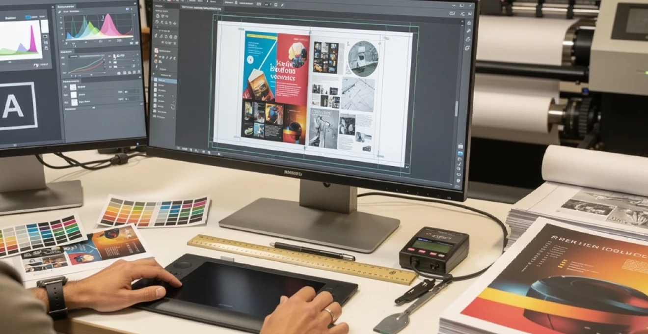
Understanding Print-Ready file specifications and technical requirements
Print-ready file specifications form the foundation of professional printing workflows, establishing the technical parameters that ensure accurate reproduction across different printing methods. These specifications encompass colour space configuration, resolution standards, dimensional accuracy, and file format selection. Each element works synergistically to create files that translate seamlessly from digital design to physical output, minimising costly reprints and production delays.
Modern prepress workflows have evolved to accommodate increasingly sophisticated printing technologies, requiring designers to understand complex technical relationships between file preparation and output quality. The transition from traditional paste-up methods to digital workflows has democratised design capabilities while simultaneously raising the bar for technical proficiency. Today’s print professionals must navigate intricate colour management systems, understand substrate-specific requirements, and implement quality control protocols that ensure consistent results.
CMYK colour profile setup for accurate colour reproduction
CMYK colour space configuration represents one of the most critical aspects of print file preparation, directly impacting colour accuracy and reproduction quality. Unlike RGB displays that create colour through additive light emission, CMYK printing relies on subtractive colour mixing using cyan, magenta, yellow, and black inks. This fundamental difference requires careful colour space conversion and profile management to achieve predictable results.
Professional workflows typically employ standardised CMYK profiles such as SWOP (Specifications for Web Offset Publications) for general commercial printing or custom press profiles for specific printing conditions. These profiles define the colour gamut limitations and ink behaviour characteristics of particular printing processes, enabling accurate colour prediction and consistent reproduction across different jobs and printing facilities.
Proper CMYK profile selection can improve colour accuracy by up to 15% compared to generic colour space conversion, significantly reducing the need for press corrections and reprints.
Resolution standards: 300 DPI requirements for professional output
Resolution requirements for professional printing are governed by the relationship between viewing distance, print size, and output device capabilities. The standard 300 DPI specification for most commercial printing applications derives from the optimal balance between file size, processing speed, and visual quality when viewed at typical reading distances. However, understanding when to deviate from this standard is crucial for professional practice.
Large-format printing applications often require lower resolution settings due to increased viewing distances, whilst high-end art reproduction may demand resolutions exceeding 600 DPI. The key lies in matching resolution to the specific application requirements and output device capabilities. Modern digital printing systems can often handle higher resolutions effectively, but the benefits must be weighed against increased file sizes and processing times.
Bleed area configuration and safety margin guidelines
Bleed area configuration ensures that printed elements extend beyond trim lines, preventing unsightly white edges that can occur due to slight variations in cutting accuracy. Standard bleed specifications typically call for 3mm extension beyond the final trim size, though this can vary based on substrate thickness, cutting methods, and finishing requirements. Safety margins, conversely, define the minimum distance that critical elements should maintain from trim edges.
Professional workflows often employ more sophisticated bleed strategies for complex finishing operations. Perfect-bound publications require spine calculations that account for paper thickness and binding methods. Die-cut applications demand precise registration between bleed areas and cutting paths. Understanding these nuances enables designers to create files that accommodate production realities whilst maintaining design integrity.
File format selection: PDF/X-1a vs PDF/X-4 standards
PDF/X standards provide industry-specific guidelines for print-ready file creation, with PDF/X-1a and PDF/X-4
standards addressing different stages of the print production workflow. PDF/X-1a mandates that all fonts are embedded, colours are converted to CMYK or spot colours, and transparency is fully flattened. This makes it ideal for conventional offset litho workflows and older RIPs that may not handle live transparency reliably. PDF/X-4, by contrast, supports live transparency and ICC-based colour management, making it better suited to modern digital and hybrid print environments.
Choosing between PDF/X-1a and PDF/X-4 should be guided by your print provider’s RIP capabilities and the complexity of your artwork. For straightforward commercial print jobs with limited transparency effects, PDF/X-1a remains a safe, predictable standard. For complex layouts that rely heavily on transparency, soft shadows, and layered effects, PDF/X-4 offers more flexibility and often cleaner output. Whatever standard you select, aligning it with the printer’s requirements at the briefing stage will prevent file rejections and unexpected visual shifts.
Advanced adobe creative suite preparation techniques
Adobe Creative Suite applications form the backbone of most professional print workflows, and mastering their advanced features is essential for creating robust print-ready files. While basic export settings are often sufficient for simple jobs, complex multi-page layouts, large-format graphics, and vector-rich artwork demand more refined preparation. This includes disciplined asset management, correct font handling, image optimisation, and rigorous preflight checks before you release files to production.
By leveraging native tools in InDesign, Photoshop, and Illustrator, you can systematically identify and resolve technical issues long before they reach prepress. This proactive approach reduces last-minute corrections, accelerates approval cycles, and gives you more control over how your designs translate on press. In many studios, these advanced techniques are formalised into internal checklists or standard operating procedures to ensure every project meets the same professional standard.
Indesign package files and font embedding protocols
InDesign’s Package function remains one of the most reliable methods for consolidating all assets required for a print project. When you choose File > Package, InDesign gathers linked images, fonts, and the INDD file into a single folder, alongside a report summarising colour spaces, image resolutions, and missing assets. This not only ensures your printer receives a complete, self-contained project but also serves as an internal audit of your document’s technical health.
For final delivery, most printers prefer a press-ready PDF rather than the full packaged folder, but packaging is still invaluable during production. It helps you confirm that all fonts are legally licensed and available, and that no low-resolution or RGB images have slipped into the layout. When exporting to PDF, always enable font embedding rather than subsetting where possible, especially for documents with repeated text elements or complex typography. Proper font embedding avoids reflow, font substitution, and character encoding issues on the RIP.
Photoshop image optimisation for large format printing
Preparing images in Photoshop for large-format printing requires a balance between resolution, file size, and visual perception at viewing distance. While small-format commercial printing typically targets 300 DPI at final size, large-format graphics such as banners, exhibition panels, and vehicle wraps often look flawless at 100–150 DPI due to increased viewing distance. Upsampling every image to 300 DPI at billboard scale is rarely necessary and can introduce artefacts or unwieldy file sizes.
For optimal results, resize artwork in Photoshop to the final print dimensions using high-quality resampling methods such as Preserve Details 2.0. Apply sharpening as a final step, tailored to the substrate and print method: slightly stronger sharpening for textured or matte materials, and more restrained sharpening for glossy media that accentuates contrast. Where possible, maintain 16-bit data during retouching and toning for smoother gradients, converting to 8-bit just before export if your printer requires it. This workflow preserves tonal nuance while keeping your large-format print files efficient and stable.
Illustrator vector path management and stroke weight adjustments
In Illustrator, clean vector path management is essential for predictable output, especially in signage, packaging, and branding applications where crisp edges and consistent line weights are critical. Excessive anchor points, stray paths, and overlapping shapes can inflate file complexity, slow RIP processing, and create unexpected artefacts when flattened. Regularly using tools such as Simplify and Pathfinder to tidy vector structures helps maintain efficient, production-friendly artwork.
Stroke weights deserve particular attention for small-format print and fine detailing. Hairline strokes that look acceptable on-screen may either disappear or print inconsistently, especially on uncoated stocks or at small sizes. A practical rule of thumb is to keep essential strokes above 0.25 pt for offset printing and slightly higher for digital presses. When strokes must scale with artwork, convert critical strokes to outlines at final size to preserve apparent thickness and avoid device-dependent variations.
Preflight panel configuration for error detection
InDesign’s Preflight panel offers a powerful, real-time safeguard against common print file errors, yet many designers underuse it. By configuring custom preflight profiles, you can enforce house standards for colour spaces, resolution thresholds, missing fonts, overset text, and bleed requirements. Once a profile is active, InDesign continuously monitors your document and flags issues in the Preflight panel, allowing you to address them while you work rather than at the export stage.
For example, you might set a rule that all placed images must be at least 300 PPI at effective size, CMYK or grayscale only, with no RGB allowed. You can also specify minimum font sizes for body text, flag non-proportional scaling of images, or catch transparency blends that might conflict with your chosen PDF/X standard. Treat the preflight panel as an automated quality control assistant: the more specific your rules, the fewer surprises you and your printer will encounter at prepress.
Transparency flattening settings for complex artwork
Transparency effects—drop shadows, soft glows, opacity blends, and layered imagery—are now standard in print design, but they still require careful handling for reliable output. Older RIPs and some specialised finishing workflows may not support live transparency, necessitating flattening either at export or prepress. When exporting to PDF/X-1a, for example, InDesign and Illustrator will flatten transparency according to the chosen Transparency Flattener Preset, converting live effects into a combination of vector and raster elements.
For complex artwork, use the High Resolution flattener preset and avoid flattening at resolutions below 300–600 PPI, especially where fine type or line work interacts with transparency. Vector text should remain editable and not be rasterised wherever possible; consider keeping type on separate layers above transparent imagery to prevent it from being converted to pixels. As a best practice, always output a proof PDF and zoom to at least 400% to inspect edges where transparency and type overlap. This is often where stitching, halos, or subtle artefacts can appear if flattening settings are too aggressive.
Colour management systems and ICC profile implementation
Colour management systems (CMS) and ICC profiles are the backbone of accurate colour reproduction across devices, applications, and substrates. Without a coherent colour management strategy, the same file can produce radically different results on different presses, papers, or even screens. ICC profiles describe the colour behaviour of each device—monitors, scanners, proofers, presses—allowing colour conversion engines to map colours from one device space to another with predictable results.
Implementing ICC profiles effectively starts with device calibration and consistent working spaces in your design applications. You might use sRGB or Adobe RGB (1998) as your RGB working space, paired with a region-appropriate CMYK profile such as Coated FOGRA39 or GRACoL 2013. When you convert images to CMYK, choosing the correct destination profile and rendering intent—often Perceptual or Relative Colorimetric—helps maintain visual balance even when colours fall outside the printable gamut. A well-managed colour workflow becomes especially critical when you’re producing campaigns across multiple substrates, like uncoated stationery, coated brochures, and large-format displays.
Typography and font management for commercial printing
Typography plays a central role in commercial printing, where readability, brand consistency, and technical reliability must coexist. Poor font management can lead to substituted typefaces, reflowed text, or even missing characters on press, all of which can compromise brand integrity. Professional workflows treat fonts not just as creative assets but as technical resources that must be controlled, licensed, and tested within the print-ready file.
Beyond basic font embedding, advanced typographic control involves aligning type to grids, optimising leading for specific formats, and using OpenType features for refined micro-typography. These practices help you deliver documents that are not only aesthetically polished but also structurally robust. When you combine sound font management with thoughtful layout decisions, you dramatically reduce the risk of production errors and improve the overall legibility and impact of your printed materials.
Opentype feature activation and glyph substitution
OpenType fonts offer a wealth of advanced typographic features—ligatures, small caps, oldstyle figures, stylistic alternates—that can elevate the sophistication of your print design. In applications like InDesign and Illustrator, you can activate these features in the Character or OpenType panels, enabling automatic glyph substitution based on your chosen settings. For example, enabling discretionary ligatures can replace character pairs like “Th” or “ff” with more elegant, custom-drawn forms.
When used intelligently, OpenType features improve rhythm, readability, and brand personality without adding extra manual work. However, they must be tested at the final printed size and on the target substrate. Some discretionary ligatures or swash characters that look graceful at large display sizes may reduce clarity in small body text. As with any advanced typography, the goal is to support the message and visual hierarchy, not to draw attention to the font technology itself.
Font licensing compliance for commercial distribution
As commercial print runs scale and designs are distributed across multiple channels, font licensing moves from a theoretical concern to a legal obligation. Many professional typefaces require specific licenses for desktop use, web embedding, app distribution, or server deployment. Using unlicensed fonts in commercial print projects can expose both you and your clients to copyright claims, especially when high-visibility campaigns or large editions are involved.
To stay compliant, maintain a centralised record of font licenses within your studio or organisation, and restrict production work to approved type families. When packaging InDesign or Illustrator files for external printers, check whether your license allows you to share font files, or if you should instead supply outlined type or press-ready PDFs with embedded subsets. Taking licensing seriously not only protects you legally but also reinforces professional standards in the print production ecosystem.
Baseline grid alignment and leading optimisation
Consistent baseline alignment is one of the subtle hallmarks of professional typography in print. By aligning body text to a baseline grid, you ensure that lines of type across multiple columns or facing pages sit on the same horizontal rhythm, improving readability and visual harmony. In InDesign, you can set up a document-wide baseline grid based on your primary body text leading—say, a 12 pt baseline for 10 pt text with 12 pt leading—and then instruct text frames to align to that grid.
Optimising leading is both a technical and aesthetic decision. Too-tight leading can create dense, hard-to-read pages, while over-generous leading may fragment content and waste valuable real estate, particularly in multi-page documents like books or reports. As a guideline, leading of 120–140% of the type size often yields comfortable results for body text, but you should adjust based on typeface design, column width, and target audience. Printing a mocked-up spread at actual size is still one of the most reliable ways to evaluate whether your leading works in practice.
Small caps and ligature implementation standards
Proper use of small caps and ligatures can significantly refine the appearance of headings, acronyms, and running text in print. True small caps—those designed as part of the font, accessible via OpenType features—maintain stroke weight and proportion, unlike faux small caps generated by simple scaling. In InDesign, enabling the Small Caps option for an OpenType font that supports them triggers genuine small-cap glyph substitution, resulting in a more balanced typographic colour.
Similarly, standard ligatures (such as “fi” and “fl”) are usually safe to enable globally in body text, enhancing texture without affecting readability. Discretionary ligatures and decorative alternates should be reserved for display typography, pull quotes, or logotypes where you can assess their impact carefully. As a rule, always verify that your small caps and ligatures remain clear at the final printed size and that they do not introduce confusion in technical contexts, such as part numbers or URLs where exact character recognition is crucial.
Pantone spot colour specification and conversion accuracy
Pantone spot colours remain essential in brand-critical print applications, where logo hues must match precisely across different print runs and substrates. When you specify a Pantone colour in Illustrator or InDesign, you are effectively instructing the printer to use a premixed ink with defined spectral properties, rather than building the colour from CMYK process inks. This approach delivers higher consistency and can achieve colours that fall outside the standard CMYK gamut, such as vivid oranges or deep blues.
However, in many digital and four-colour offset workflows, Pantone colours must be converted to CMYK. Relying on default software conversions can result in noticeable shifts, especially for saturated or fluorescent hues. Whenever spot colours will be simulated in CMYK, review the conversion values recommended by your print provider or Pantone’s own CMYK guides, and soft-proof the result using appropriate ICC profiles. If exact brand colour fidelity is non-negotiable, communicate clearly with your printer about whether true spot inks will be used or if a CMYK approximation is the only viable option.
Soft proofing techniques using monitor calibration
Soft proofing bridges the gap between what you see on screen and what will emerge on paper, but it only works reliably if your monitor is calibrated and profiled. Hardware calibration devices measure your display’s characteristics and generate a monitor ICC profile, which your operating system and design applications can then use to present colours more accurately. Without this step, soft proofs are little more than educated guesses.
Once your monitor is profiled, applications like Photoshop and InDesign allow you to select a specific output profile—such as a coated offset press on gloss stock—and simulate its behaviour via View > Proof Setup. Enabling options like Simulate Paper Color and Simulate Black Ink gives you a closer approximation of how the paper’s whiteness and ink density will affect your design. While no monitor can perfectly match a physical print, especially in different lighting conditions, a disciplined soft proofing workflow significantly reduces surprises and the number of hard proof iterations required.
Gracol 2013 and FOGRA standards implementation
Industry standards such as GRACoL 2013 and FOGRA provide reference printing conditions that help synchronise expectations between designers, print buyers, and press operators. GRACoL 2013 (commonly associated with the CGATS21_CRPC6 profile) is widely used in North America for general commercial printing on coated stocks. In Europe and many other regions, FOGRA standards—such as FOGRA39 and its successors—define similar reference conditions for sheetfed offset printing.
By adopting these standard profiles in your colour management settings, you align your on-screen and proofing expectations with how most commercial presses are calibrated. This simplifies communication with multiple vendors and makes soft proofing more reliable. When a printer works to a GRACoL or FOGRA standard, you can be more confident that a file prepared with those ICC profiles will reproduce as intended, assuming substrates and finishing processes are comparable. For brand owners running campaigns across markets, standardised profiles form a crucial part of a global colour consistency strategy.
Quality control protocols and prepress verification methods
Robust quality control is the final safeguard between your print-ready file and the press. Even when you have followed every best practice in file preparation, systematic verification ensures that no overlooked issue undermines print quality or causes costly delays. Professional prepress departments rely on a combination of automated preflight checks, visual inspection, and contract proofing to validate incoming files before they are released to production.
At your end, adopting similar protocols can dramatically reduce the risk of file rejection or unexpected results. Start with automated preflight tools—either built into applications like InDesign or provided by third-party software—that scan for common issues: missing fonts, RGB images, insufficient bleed, low-resolution assets, and incompatible colour spaces. Complement these checks with a manual review of a high-resolution PDF at 100–200% zoom, paying particular attention to fine text, overprints, transparency-heavy areas, and critical brand elements.
For colour-critical or high-value jobs, contract proofs remain the gold standard of prepress verification. These can be digital proofs produced on calibrated proofing devices using the same ICC profiles as the press, or, in some cases, press proofs run on the actual production machine and stock. Reviewing and signing off a contract proof establishes a shared visual reference between you and your printer, clarifying expectations and responsibilities. By integrating these quality control protocols into your workflow, you move from reactive troubleshooting to proactive assurance—ensuring your print files perform exactly as designed when they reach the press.