In the digital landscape where user attention spans continue to shrink and competition intensifies, the smallest details often make the most significant difference. Microcopy—those brief, carefully crafted words that guide users through digital experiences—has emerged as a powerful tool for enhancing user engagement and driving conversions. From button labels and error messages to form instructions and loading screens, these seemingly minor text elements shape how users perceive, interact with, and ultimately feel about digital products.
The psychology behind microcopy effectiveness lies in its ability to reduce cognitive load, build trust, and create emotional connections at critical interaction moments. Research indicates that well-crafted microcopy can improve conversion rates by up to 14.79% and significantly reduce user abandonment during key processes. As digital experiences become increasingly sophisticated, the strategic implementation of microcopy has evolved from an afterthought to a fundamental component of user experience design.
Microcopy fundamentals and UX writing principles
Microcopy encompasses the small but mighty text elements that facilitate user interactions across digital platforms. Unlike traditional marketing copy that aims to persuade, microcopy serves a primarily functional purpose—guiding users through specific actions while maintaining brand voice and personality. This distinction is crucial for understanding how to craft effective interface text that truly enhances user experience.
The foundational principles of effective microcopy center on clarity, conciseness, and contextual relevance. Every word must earn its place by either providing essential information, reducing user anxiety, or facilitating task completion. Successful microcopy anticipates user needs and addresses potential concerns before they become barriers to engagement.
Button copy optimisation for conversion rate enhancement
Button text represents one of the most critical microcopy elements, directly influencing user decisions at key conversion points. Generic labels like “Submit” or “Click Here” fail to convey value or set proper expectations. Instead, action-oriented phrases that clearly communicate outcomes perform significantly better in driving user engagement.
Research from leading conversion optimization platforms reveals that specific, benefit-focused button copy can increase click-through rates by 28-42%. For instance, changing “Register” to “Create Your Free Account” immediately communicates value while reducing perceived effort. The psychological principle at work involves reducing decision fatigue by eliminating uncertainty about what happens next.
Error message psychology and user frustration mitigation
Error messages present unique opportunities to transform potentially negative experiences into moments of helpful guidance. Traditional error messages that simply state what went wrong often increase user frustration and abandonment rates. Effective error microcopy reframes these moments as collaborative problem-solving opportunities.
The most successful error messages follow a three-part structure: acknowledgment of the issue, explanation of why it occurred, and clear guidance for resolution. Empathetic language choices can significantly reduce user stress during error states. For example, “We’re having trouble processing your payment. Please check your card details and try again” performs better than “Payment failed – Error 402.”
Form field labels and placeholder text best practices
Form interactions represent critical engagement points where poorly crafted microcopy often leads to user abandonment. Effective form microcopy eliminates ambiguity, reduces input errors, and maintains user momentum through potentially complex processes. The strategic use of labels, placeholder text, and helper text creates a supportive environment for task completion.
Industry data shows that forms with clear, descriptive microcopy experience 34% fewer abandonment rates compared to those with generic labels. The key lies in balancing information density with visual clarity. Progressive disclosure techniques allow forms to provide necessary guidance without overwhelming users with excessive text at initial presentation.
Tooltip microcopy for progressive information disclosure
Tooltips serve as on-demand information resources, providing contextual assistance without cluttering the primary interface. Effective tooltip microcopy follows the principle of just-in-time information delivery, offering relevant details precisely when users need them most.
The optimal tooltip strategy involves layering information based on user expertise levels and task complexity. Advanced users might require technical specifications, while newcomers benefit from basic explanatory text. This approach ensures that interface complexity scales appropriately with
the user’s needs and confidence level. When designing tooltip microcopy, we should treat it as a dialogue: what would a user likely ask at this exact moment, and how can we answer in a single, crystal-clear sentence? Keeping tooltips under 120 characters, avoiding jargon, and ensuring they make sense when read aloud all contribute to a smoother, more intuitive experience.
Psychological triggers in microcopy design
Behind every effective piece of microcopy is a set of psychological principles that help users feel oriented, reassured, and motivated. Rather than manipulating users, ethical UX writing uses these triggers to support better decision-making and reduce friction. By understanding how people process information, manage attention, and respond emotionally, we can design interface text that feels almost invisible while quietly doing critical work in the background.
Psychological triggers in microcopy often operate at a subconscious level. Users rarely stop to analyse why a phrase feels comforting or why a particular call-to-action seems easier to click. Yet elements like cognitive load reduction, emotional resonance, trust signals, and subtle urgency cues all shape behaviour. When applied thoughtfully, these triggers help users progress through key journeys—such as onboarding or checkout—without feeling rushed or pressured.
Cognitive load reduction through concise interface text
Cognitive load refers to the mental effort required to process information and complete a task. In digital interfaces, every extra word, unclear phrase, or ambiguous label adds to that load. Microcopy that is concise and specific acts like a well-signposted road, while vague or wordy text feels more like navigating an unmarked maze. The goal is to minimise the decisions users must consciously make at each step.
One practical approach is to replace abstract instructions with concrete, direct language. For instance, instead of “Provide additional details if necessary,” try “Add delivery instructions for your driver.” This simple shift reduces interpretation work. Another effective tactic is chunking information into smaller segments, supported by progressive disclosure so that users only see additional helper text when they signal they need it, such as clicking “Learn more” or opening an accordion.
Emotional resonance in CTA microcopy strategy
CTAs do more than tell users what to do; they communicate how the action will make them feel. Emotional resonance in CTA microcopy can transform a neutral click into a motivated decision. Phrases like “Save my spot” or “Secure my booking” tap into a desire for certainty and control, whereas “Get started” can evoke momentum and progress. When users sense emotional alignment between their goals and the interface, they are more likely to commit.
To design emotionally resonant CTAs, we need to map the user’s emotional state at each stage of the journey. Are they anxious about cost, curious about value, or excited about an outcome? A CTA for a budgeting app might lean into reassurance—”Start organising your finances”—while a creative tool might opt for inspiration—”Create your first design.” Testing variations that reflect different emotional tones is key to finding the right fit for your audience.
Trust signal integration via security and privacy messaging
Trust is one of the strongest psychological levers in UX writing. Microcopy around security and privacy either reassures users or raises red flags. When asking for sensitive data—like payment details or personal identification—transparent, straightforward messaging can dramatically reduce hesitation. Simple lines such as “We’ll never share your details without your permission” or “Your payment is encrypted and secure” directly address typical user fears.
Effective trust microcopy is specific rather than generic. Instead of vague claims about “industry-leading security,” referencing recognisable standards or concrete practices (for example, “Protected with 256-bit SSL encryption”) is more credible. Placing these trust signals close to the relevant interaction—near the credit card field or sign-up form—ensures they appear precisely when users need reassurance, rather than buried in a distant privacy policy.
Urgency and scarcity principles in action-oriented copy
Urgency and scarcity, when used ethically, help users make timely decisions without endless procrastination. Microcopy that highlights limited-time offers or low stock levels can nudge users who are already interested but hesitant. Phrases like “Offer ends in 2 hours” or “Only 3 seats left for this session” introduce a gentle push, framing inaction as a potential missed opportunity rather than a neutral choice.
However, overusing urgency language quickly erodes trust. If every message screams “Last chance!” users become desensitised or suspicious. A more sustainable approach is to reserve urgency and scarcity microcopy for genuinely time-bound or limited resources and pair it with clarity on what will change. For example, “Early-bird pricing ends tonight—save 20% when you book now” clearly explains the benefit and the consequence of waiting.
Platform-specific microcopy implementation strategies
While core UX writing principles remain consistent, microcopy must adapt to the conventions, constraints, and contexts of different platforms. A phrase that works perfectly on desktop might feel cramped or out of place on mobile, just as microcopy on native apps must account for offline states and OS-specific patterns. Understanding each environment allows us to shape microcopy that feels native rather than forced.
On mobile interfaces, character limits and screen size demand ruthless prioritisation. Button labels and helper text need to be shorter yet still meaningful, often relying on established mobile patterns like bottom sheets and in-line error states. Web applications typically offer more space for explanatory copy, but they also introduce complexity—multiple navigation layers, modals, and tooltips competing for attention. Meanwhile, native apps must integrate with system-level alerts and permissions, making microcopy around notifications, access requests, and background activity especially critical for building trust.
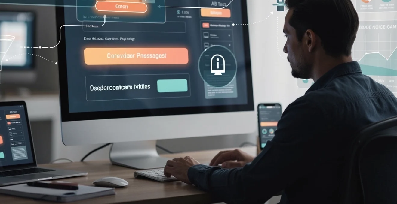
A/B testing methodologies for microcopy performance
Even the most experienced UX writers rely on data to validate whether microcopy is truly working. A/B testing provides a structured way to compare different versions of text and measure their impact on user engagement, task completion, and conversion rates. By isolating specific variables—such as CTA wording or error message phrasing—we can make informed decisions rather than relying solely on intuition or stakeholder preference.
Effective A/B testing for microcopy starts with a clear hypothesis: for instance, “Adding benefit-focused language to our primary CTA will increase click-through by 10%.” From there, we design experiments that control for layout, colour, and position so that any observed changes in performance can reasonably be attributed to the text itself. Over time, these experiments build a knowledge base about what kind of language resonates best with a particular audience.
Multivariate testing frameworks for button text variations
While simple A/B tests compare two versions, multivariate testing allows teams to explore several copy variations at once. For button text, this could include different combinations of verbs, benefits, and tone—such as “Start free trial,” “Try it free for 7 days,” or “Explore all features free.” Multivariate frameworks allocate traffic across these options and identify which combination yields the highest conversion rate.
The key is to avoid testing too many variables at once on low-traffic pages, which can dilute results and prolong the time needed to reach significance. A practical approach is to begin with two or three strong contenders that differ meaningfully, not just by a single synonym. From there, we can refine the winning version through smaller, more focused experiments, gradually zeroing in on the most effective language.
Statistical significance measurement in copy testing
Interpreting test results requires a basic understanding of statistical significance. A small uplift in conversions may look promising, but without enough data we cannot be confident it isn’t just random noise. Most experimentation tools now provide built-in significance indicators, yet it’s still important to know what they mean. In many cases, aiming for at least 95% confidence and a minimum sample size per variant ensures more reliable conclusions.
To put it simply, the more traffic and conversions a test accumulates, the clearer the picture becomes. Ending tests too early can lead to adopting a variant that appears better but underperforms in the long run. On the other hand, endlessly running experiments without acting on insights wastes time. Establishing upfront criteria—such as “we’ll run this test until we have 1,000 conversions per variant or 28 days have passed”—helps teams balance rigour with pragmatism.
Heat map analysis for microcopy placement optimisation
While A/B tests tell us which wording works best, heat maps reveal how users actually interact with pages and where they pay attention. Scroll maps, click maps, and hover maps can show whether microcopy is visible at the right time or getting lost in less-viewed areas. If users never scroll to see an important reassurance message near the bottom of a form, even the best copy won’t help.
By overlaying heat map data with conversion metrics, we can make smarter decisions about microcopy placement. For instance, if tooltips receive little interaction, it may indicate that users either don’t notice them or don’t understand their affordance. Adjusting icon labels, positions, or even turning key tooltip content into always-visible helper text can dramatically increase the impact of the same underlying message.
Conversion funnel impact assessment through copy changes
Microcopy rarely affects just a single step; it often influences the entire conversion funnel. A more reassuring sign-up message could increase account creations but might also affect downstream metrics like activation and retention. To fully understand its impact, we need to look beyond click-through rates and consider the broader journey. Are users who respond to a particular CTA more likely to complete onboarding or make a purchase later?
Modern analytics tools make it possible to tag experiments and track their effects over multiple sessions and events. By comparing cohorts exposed to different microcopy variants, teams can uncover long-term patterns that one-step metrics would miss. This holistic view helps avoid optimising for shallow gains—such as more clicks but lower-quality sign-ups—and instead focuses on sustainable user engagement and value.
Voice and tone consistency across digital touchpoints
As brands expand across websites, mobile apps, email, chatbots, and social channels, maintaining a consistent voice becomes a significant challenge. Microcopy sits at the heart of this challenge because it appears in so many tiny, scattered moments. If a brand’s homepage feels warm and human but its error messages sound robotic or its app notifications feel aggressive, users experience a jarring disconnect.
To prevent this fragmentation, many teams develop voice and tone guidelines that include specific examples of microcopy for common scenarios: errors, confirmations, onboarding, and permissions. These guidelines define the core voice—such as “friendly, clear, and confident”—and show how tone flexes based on context. For instance, a playful tone may suit empty-state messages, while a more serious, direct tone is appropriate for billing issues. Embedding these examples directly in design systems and component libraries helps designers and developers apply them consistently.
Advanced microcopy techniques for user retention
Once users have signed up or made an initial purchase, microcopy continues to play a vital role in keeping them engaged. Retention often hinges on whether users understand ongoing value and feel supported as they explore deeper features. Smart, contextual microcopy can highlight next-best actions, surface underused capabilities, and celebrate meaningful milestones in a way that feels personal rather than pushy.
For example, in-product nudges such as “You’re one step away from completing your profile” or “Invite a teammate to get more from your workspace” guide users toward behaviours correlated with long-term engagement. Likewise, lifecycle emails and in-app messages that acknowledge real progress—”You’ve created your first three projects; here’s what power users do next”—use microcopy to bridge data and motivation. By treating every small piece of text as an opportunity to reassure, encourage, or clarify, we can turn fleeting interactions into lasting relationships with your product.