Digital content faces an unprecedented challenge: capturing and maintaining reader attention in an environment saturated with information. Every second counts when visitors land on your website, and the clarity of your writing determines whether they stay engaged or click away. Readability optimization has evolved from a nice-to-have feature into a critical success factor for digital publishers, affecting everything from user engagement metrics to search engine rankings. The science of readable content combines linguistic analysis, cognitive psychology, and data-driven design principles to create text that resonates with diverse audiences across multiple devices and platforms.
Flesch reading ease score and readability metrics for digital publishers
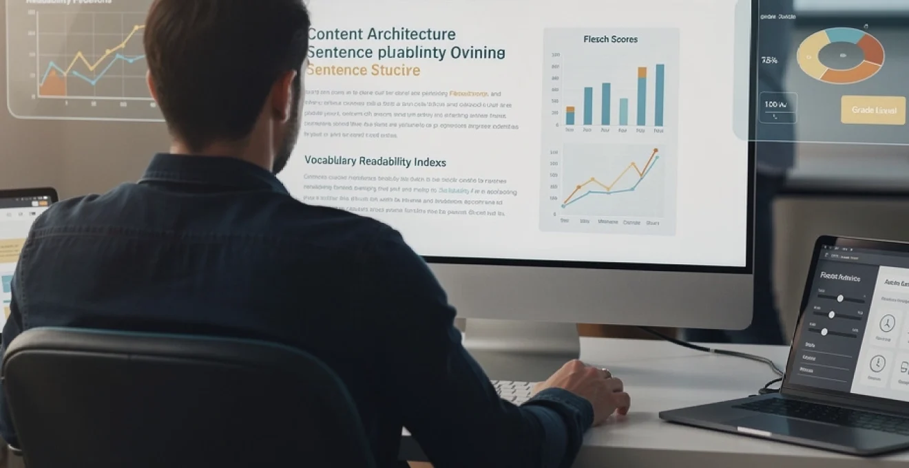
Readability metrics provide quantifiable measurements that reveal how accessible your content truly is to your intended audience. These formulas analyse linguistic patterns—sentence complexity, word length, syllable distribution—to generate scores that predict comprehension difficulty. The Flesch Reading Ease Score remains the most widely recognised metric, producing values between 0 and 100, where higher scores indicate easier reading. Content scoring 60-70 targets general adult audiences, whilst scores above 80 suggest elementary-level accessibility. Digital publishers should understand that these metrics serve as diagnostic tools rather than absolute standards. Context matters enormously: a technical white paper addressing cybersecurity professionals might appropriately score lower than a consumer-focused product description, and that’s perfectly acceptable when your audience expects specialised terminology and complex explanations.
Calculating Flesch-Kincaid grade level for target audiences
The Flesch-Kincaid Grade Level translates readability into U.S. educational equivalents, providing intuitive benchmarks for content creators. A score of 8.0 indicates writing comprehensible to an eighth-grade student (roughly 13-14 years old). Most commercial websites should target grade levels between 6 and 10 to maximise audience reach without compromising message sophistication. This formula calculates grade level using average sentence length (ASL) and average syllables per word (ASW): 0.39(ASL) + 11.8(ASW) – 15.59. You can immediately improve your grade level score by shortening sentences and choosing simpler vocabulary alternatives. Replace “utilise” with “use”, “commence” with “start”, and “terminate” with “end”. These substitutions don’t diminish your authority—they demonstrate respect for your reader’s time and cognitive resources.
SMOG index application in Long-Form web content
The Simple Measure of Gobbledygook (SMOG) Index specifically evaluates longer content pieces, requiring at least 30 sentences for accurate assessment. This metric particularly suits blog posts, articles, and comprehensive guides exceeding 1,000 words. SMOG calculates readability by counting polysyllabic words (those containing three or more syllables) within sample sentences, then applying mathematical transformations to estimate comprehension requirements. Long-form content creators should monitor SMOG scores alongside other metrics because extended articles often introduce complexity through cumulative information rather than individual sentence structure. You might maintain perfectly readable sentences yet overwhelm readers with relentless technical concepts appearing paragraph after paragraph throughout your piece.
Gunning fog index benchmarks for B2B versus B2C writing
The Gunning Fog Index measures years of formal education required to understand text on first reading, making it particularly valuable when distinguishing between business-to-business (B2B) and business-to-consumer (B2C) content strategies. B2C content typically targets Fog Index scores between 8-10, reflecting general consumer reading preferences for straightforward, accessible information. B2B content addressing industry professionals might appropriately reach scores of 12-14, acknowledging that decision-makers in specialised fields expect—and appreciate—precise technical terminology. The formula considers average sentence length and percentage of complex words: 0.4 [(words/sentences) + 100 (complex words/words)]. Does your content match your audience’s expertise level? Misaligned complexity either patronises knowledgeable readers or alienates novices seeking introductory information.
Automated readability index integration in content management systems
The Automated Readability Index (ARI) distinguishes itself by analysing character counts rather than syllable counts, making it computationally efficient for real-time content analysis within digital publishing platforms. Content
platforms and content management systems. Modern CMS solutions increasingly embed ARI-based checks into their editors, offering instant feedback as writers draft or revise copy. Because ARI relies on characters per word and words per sentence, it works well for languages with irregular syllable structures and for fast, large-scale content analysis. Digital publishers can configure editorial workflows so that content failing predetermined ARI thresholds is flagged for revision before publication. When combined with Flesch, SMOG, and Gunning Fog metrics, ARI helps create a multi-dimensional readability profile that supports strategic decisions about tone, depth, and target reading level.
Typographic hierarchy and scannable content architecture
Even the most readable sentences fail if your page layout discourages people from reading them. Typographic hierarchy and scannable content architecture determine how quickly users can locate the information they care about. Online reading is dominated by scanning rather than line-by-line reading, especially on news sites, blogs, and knowledge bases. You must therefore design headings, subheadings, and body text so that key messages stand out instantly. Effective readability for online content emerges from the synergy between clear language and deliberate visual structure.
F-pattern and Z-Pattern eye-tracking heatmap analysis
Eye-tracking studies by organisations such as Nielsen Norman Group consistently reveal two dominant scanning behaviours: the F-pattern and the Z-pattern. In the F-pattern, common on text-heavy pages, users scan horizontally across the top, then move down slightly and scan again, before skimming vertically along the left side. The Z-pattern appears more often on minimalist landing pages, where attention moves in a zig-zag shape from top left to top right, then diagonally to the lower left and across again. Understanding these patterns helps you place headlines, subheadings, bullets, and calls to action where eyes naturally travel first. If your most important information lives in the bottom-right corner of a dense paragraph, how many readers will ever see it?
To leverage eye-tracking insights, prioritise concise, descriptive headings in the upper sections of your page and along the left margin. Align introductory paragraphs, key value propositions, and primary calls to action with the F-pattern’s horizontal bars. On Z-pattern layouts, such as hero sections with large imagery, ensure that the top-right segment contains a compelling summary or button that rewards the reader’s initial scan. Heatmap tools and scroll-depth analytics provide real-world confirmation that your content architecture matches these theoretical patterns. Over time, you can iterate heading placement, line length, and content density to better support natural scanning behaviour.
Modular content blocks using inverted pyramid methodology
The inverted pyramid methodology, borrowed from journalism, places the most essential information at the top, followed by supporting details and then background context. For digital publishers, combining the inverted pyramid with modular content blocks creates highly scannable pages that respect short attention spans. Each block functions as a self-contained unit with a clear micro-headline, a brief explanation, and optional supporting elements such as quotes or statistics. Readers can skim multiple blocks and still extract core insights without committing to every word on the page.
Think of these modular blocks as content “cards” in a dashboard: easy to rearrange, expand, or summarise based on user needs. You might begin an article with a compact key-takeaways block, then break the rest of the page into sections that explore each takeaway in depth. This structure works particularly well for long-form guides, where traditional essay-style layouts can feel overwhelming. By building your readability strategy around modular, inverted-pyramid blocks, you make it easier for readers to enter at any point and still understand your main arguments. For content teams, this modular approach also streamlines updates, as you can revise individual sections without rewriting entire articles.
White space ratio optimization for cognitive load reduction
White space—sometimes called negative space—is not wasted real estate; it is an essential readability tool that reduces cognitive load. Dense blocks of text increase visual fatigue and discourage deep reading, especially on smaller screens. Research on information processing shows that people can only hold a limited number of elements in working memory at once. Generous margins, line spacing, and spacing between paragraphs segment information into manageable chunks, much like aisles in a supermarket help shoppers navigate complex inventories.
From a practical standpoint, aim for comfortable line spacing (around 1.4–1.6 times the font size) and avoid lines longer than 70–80 characters on desktop. This combination allows the eye to move smoothly without losing its place. Designers and editors should collaborate to maintain consistent white space ratios across templates, not just on flagship landing pages. You can use simple A/B tests to compare bounce rate, time on page, and scroll depth for layouts with different spacing schemes. Often, modest increases in white space deliver disproportionate gains in perceived professionalism and reading comfort.
Subheading frequency standards based on nielsen norman group research
Nielsen Norman Group’s usability research repeatedly highlights the value of frequent, meaningful subheadings for online readability. Users skim headings to decide whether to continue reading, jump to another section, or abandon the page altogether. As a rule of thumb, long-form digital content benefits from subheadings every 200–300 words, though highly technical or instructional material may require even tighter segmentation. Each subheading should accurately preview the upcoming content rather than relying on vague labels like “Overview” or “Next Steps.”
When planning your readability structure, map out subheadings as you would a table of contents. Ask yourself: if someone only read these headings, would they still understand the article’s value? Clear, keyword-informed subheadings also support search engine optimisation, helping search engines interpret topical relevance and helping users find “long-tail” answers within your page. Avoid using subheadings purely for stylistic flair; instead, treat them as functional signposts that guide both human readers and search algorithms. Over time, consistent subheading frequency and clarity will become a recognisable part of your content brand.
Sentence structure engineering for digital consumption
Sentence structure engineering focuses on how individual lines of text shape overall readability and comprehension. Online readers favour concise, direct sentences that deliver value quickly without unnecessary detours. You do not need to write like a children’s book, but you should avoid legalistic or academic constructions that bury meaning under layers of clauses. By intentionally designing your sentence patterns, you can control rhythm, emphasis, and cognitive effort. This is where micro-level editing has macro-level impact on engagement metrics and conversion rates.
Subject-verb-object syntax patterns for clarity maximisation
The simplest and most effective structure in English is the subject–verb–object (SVO) pattern: “You optimise content,” “Designers improve layouts,” “Readers trust clear writing.” SVO sentences foreground the actor and the action, making it easy for readers to parse who is doing what. When you introduce multiple subordinate clauses before or between these core elements, you force readers to hold extra information in memory before they reach the point. In fast-paced digital environments, that extra strain often leads to skimming or abandonment.
To maximise clarity, draft your first version in straightforward SVO patterns, then selectively vary sentence openings for rhythm once the meaning is secure. If you notice frequent sentences starting with long dependent clauses or prepositional phrases, consider rewriting them in a more direct order. Think of SVO as the backbone of your readability strategy; stylistic flourishes should enhance that backbone, not obscure it. When training new writers or briefing subject matter experts, emphasise that clear SVO constructions are not simplistic—they are efficient.
Active voice dominance in web copy conversion rates
Active voice reinforces this clarity by placing the subject before the verb and keeping responsibility visible. “Our team resolved the issue within 24 hours” feels more trustworthy and dynamic than “The issue was resolved within 24 hours.” Numerous copywriting tests show that active-voice headlines and calls to action produce higher click-through and conversion rates because they sound more decisive. In an environment where readers constantly evaluate which tab deserves their attention, decisive language wins.
To encourage active voice dominance in your web copy, scan drafts for tell-tale passive constructions like “is done,” “was created,” or “will be implemented.” Wherever possible, reassign the action to a clear subject: “You can access your report,” “Engineers designed the new feature,” “We guarantee response within one business day.” Of course, passive voice still has strategic uses, such as when the actor is unknown or irrelevant. The goal is not to eliminate passives entirely, but to ensure they remain the exception rather than the default. As you refine your content for readability, you will often find that converting passive to active immediately lowers perceived complexity.
Sentence length distribution according to readability guidelines
Readability guidelines typically recommend average sentence lengths of 15–20 words for digital content, with intentional variation to avoid monotony. Short sentences deliver impact and clarity. Longer sentences, when used sparingly, allow you to express nuanced relationships between ideas. Problems arise when a page leans too heavily to either extreme: strings of ultra-short sentences feel choppy and simplistic, while chains of 35-word sentences fatigue readers quickly.
A practical approach is to review each paragraph and identify its longest sentence. Ask yourself whether that sentence carries multiple ideas that could be separated or simplified. Tools that highlight sentence length distribution can reveal patterns you might miss while editing line by line. Aim for a mix: a concise statement to anchor the point, followed by one or two moderately complex sentences that provide explanation or evidence. This distribution creates a natural reading rhythm, similar to alternating between brisk steps and measured pauses during a walk.
Transition word density for logical flow enhancement
Transition words—such as “however,” “therefore,” “for example,” and “meanwhile”—act as signposts that guide readers through your reasoning. Without them, even clear sentences can feel disjointed, forcing readers to infer relationships between ideas. Strategic use of transition words improves perceived coherence and helps users stay oriented, especially when skimming. At the same time, excessive transitions can sound mechanical, as if each sentence were glued to the next by formula.
Consider maintaining moderate transition word density, using them when you change direction, introduce contrast, add evidence, or summarise insights. We can think of them like road markers on a highway: you do not need a sign every metre, but you definitely need them at junctions and exits. During editing, look for paragraphs where the logical shift between sentences might confuse a distracted reader. Adding a simple “In contrast,” or “As a result,” can transform a confusing sequence into a coherent argument. Over time, this attention to flow contributes as much to readability as vocabulary simplification does.
Lexical complexity management and vocabulary calibration
Lexical complexity management focuses on the words you choose and how those choices affect comprehension across different reading levels. Technical accuracy and brand authority often tempt writers to favour rare or specialised terms. Yet online audiences reward clarity and speed of understanding far more than ornate vocabulary. The challenge lies in calibrating your word choices so that experts still feel respected while non-experts never feel excluded. By intentionally managing lexical complexity, you make your content more inclusive and more search-friendly at the same time.
Dale-chall word list implementation for mass audience content
The Dale–Chall readability formula is built around a list of common words that most fourth-grade students in the U.S. are expected to understand. When your text relies heavily on words outside this familiar list, its difficulty score rises. For digital publishers targeting mass audiences—news outlets, consumer brands, public-sector websites—the Dale–Chall framework provides a practical benchmark for vocabulary selection. You can run your drafts through tools that highlight unfamiliar or advanced words, then decide case by case whether to keep, replace, or explain them.
This does not mean restricting yourself to child-level language. Instead, think of the Dale–Chall list as a safety net that flags potential barriers to comprehension. If you must use a complex term—such as “blockchain,” “neurodivergent,” or “quantitative easing”—follow it with a brief definition or example the first time it appears. Over time, your editorial team can build an internal glossary of approved, audience-appropriate terminology. This glossary helps maintain consistency across articles and ensures that readability for online content remains aligned with your mission, whether that’s public education, customer support, or thought leadership.
Latinate versus germanic word choice impact on comprehension
English offers two broad vocabularies: Latinate words, which often sound formal or technical, and Germanic words, which tend to feel direct and conversational. Compare “commence” (Latinate) with “start” (Germanic), or “utilise” with “use.” Studies on comprehension and recall show that readers generally process Germanic words faster because they are shorter, more common, and closer to everyday speech. When optimising readability, choosing the Germanic option often simplifies sentences without sacrificing precision.
You can think of Latinate words as specialised tools and Germanic words as everyday utensils. A chef needs both, but most meals rely on simple knives and pans rather than rare gadgets. In your content, reserve heavier, more formal vocabulary for situations where nuance or legal exactness demands it. Otherwise, default to short, familiar words that reduce cognitive load and make your brand sound human. This subtle shift in lexical calibration can dramatically change how approachable your writing feels, especially for readers scanning on mobile devices or in a second language.
Jargon elimination strategies without sacrificing technical accuracy
Jargon is one of the biggest obstacles to readability in specialised fields such as finance, medicine, and enterprise software. Industry insiders may find jargon efficient, but broader audiences often experience it as a foreign language. Eliminating jargon does not mean eliminating expertise. Instead, it means translating domain-specific concepts into language that a motivated outsider can follow. A useful strategy is to write first for an informed layperson, then layer in optional detail for advanced readers.
Practically, you can replace or explain jargon using analogies, plain-language descriptions, and concrete examples. Instead of saying “vertical integration optimises the value chain,” you might write, “vertical integration lets a company control more steps in making and selling a product, from raw materials to delivery.” Ask yourself: if you had to explain this idea to a curious colleague from another department, what words would you use? If a technical term is unavoidable, introduce it gradually and show its relevance before relying on it heavily. This balanced approach preserves accuracy while expanding your potential audience and improving search visibility for long-tail, question-based queries.
Mobile-first reading experience optimisation
With mobile devices accounting for a majority of global web traffic, optimising readability for mobile-first experiences is no longer optional. Small screens, variable network conditions, and touch-based interactions all shape how users consume text. A page that feels comfortable on a 27-inch monitor can turn into an impenetrable wall of text on a smartphone. Mobile-first design flips the traditional workflow: instead of adapting desktop layouts downwards, you design for the smallest viewports first, then enhance the experience on larger screens. This approach naturally favours concise, well-structured content that loads quickly and reads smoothly.
Viewport width considerations for paragraph length
Viewport width directly influences line length, which in turn affects readability. On mobile, each line contains far fewer characters than on desktop, so paragraphs that seem modest on a large monitor may sprawl across multiple screens on a phone. To optimise content for different reading levels and devices, aim for short paragraphs—typically 2–4 sentences—especially near the top of the page. This structure allows readers to progress quickly, creating a sense of momentum that encourages deeper engagement.
Designers can use responsive CSS to control maximum line length and padding at different breakpoints, but writers must also adapt their style. When drafting, periodically preview your text in a narrow window or on an actual phone to see how it “breathes” on a small screen. Ask yourself whether each paragraph delivers a single, clear idea or whether it could be split for greater clarity. By considering viewport width while writing, you avoid the all-too-common scenario where a beautifully crafted desktop article becomes exhausting on mobile.
Tap target sizing for in-text hyperlinks and call-to-action elements
Readability extends beyond text to the usability of interactive elements embedded within that text. On touch devices, small or tightly clustered tap targets can frustrate users who simply want to follow a link or click a call-to-action. Guidelines from platforms like Google and Apple recommend minimum target sizes—often around 40–48 CSS pixels—for comfortable tapping. If your in-text hyperlinks appear as tiny, tightly spaced words, readers may avoid them altogether, undermining your content strategy.
To improve the mobile reading experience, ensure that important calls to action and navigational links have generous spacing and clear visual differentiation. You can transform critical links into buttons or cards that stand out from body text while still fitting naturally within your narrative. When you combine clear microcopy (“Download the full report,” “Schedule a demo”) with accessible tap targets, you lower friction and support better engagement. In collaborative workflows, writers, designers, and developers should test on real devices to confirm that tap targets feel as usable as they look in design tools.
Responsive typography scaling using CSS clamp functions
Responsive typography ensures that text remains legible and visually balanced across a spectrum of devices, from small phones to large monitors. Traditional methods rely on media queries to adjust font sizes at specific breakpoints, but newer CSS features such as the clamp() function offer more nuanced control. With clamp(), you can define a minimum, preferred, and maximum font size that scales fluidly with viewport width. This technique helps maintain optimal line length and hierarchy without constant manual tweaking.
For example, you might set body text to clamp(1rem, 1.1vw, 1.125rem), allowing subtle growth on larger screens while preventing uncomfortably small text on mobile. Headlines can follow similar patterns with proportionally larger values. From a readability perspective, responsive typography protects against two common pitfalls: tiny fonts on small screens and excessively wide, hard-to-scan lines on large ones. When content writers understand these typographic principles, they can align their paragraph lengths and heading structures with the underlying design system, resulting in a more coherent mobile-first reading experience.
Above-the-fold content prioritisation for mobile browsers
On mobile, “above the fold” typically includes only a headline, a short introduction, and perhaps a single image or call to action. This limited real estate forces you to prioritise ruthlessly. If users cannot understand the page’s value within the first screen or two, they are likely to bounce to a competing result. Effective above-the-fold optimisation combines concise messaging with scannable formatting: a clear headline, a tight subheading or standfirst, and a brief paragraph or bullet list that explains what readers will gain.
Think of this area as the elevator pitch for your content. Use it to answer three questions quickly: What is this about? Who is it for? Why should I keep reading? On longer pages, consider adding a compact table of contents or “key insights” box that lets readers jump to the sections most relevant to them. This strategy respects the mobile user’s time while signalling that you have substantive depth available for those who want it. When you balance brevity above the fold with comprehensive, well-structured content below, you create a mobile reading journey that feels both efficient and rewarding.
Accessibility standards and inclusive reading design
Optimising readability for online content also means ensuring that people with disabilities can access and understand it. Accessibility is not just a legal requirement in many jurisdictions; it is a fundamental aspect of inclusive design. Guidelines such as the Web Content Accessibility Guidelines (WCAG) provide concrete criteria for making text, images, and interactions usable for as many people as possible. When you incorporate these standards from the outset, you improve the experience for everyone, including users with temporary impairments or challenging reading environments.
WCAG 2.1 level AA compliance for text contrast ratios
One of the most measurable aspects of accessible readability is colour contrast between text and background. WCAG 2.1 Level AA recommends a minimum contrast ratio of 4.5:1 for normal text and 3:1 for large text. These ratios help ensure that people with low vision, colour blindness, or older screens can still distinguish characters clearly. Low-contrast combinations—such as light grey text on a white background—may look sleek in mockups but become nearly unreadable in real-world conditions or bright sunlight.
Designers should use contrast-checking tools during the visual design phase, while content teams remain aware that placing critical information within low-contrast overlays or images can undermine accessibility. When you choose brand colours, test their contrast in actual content scenarios rather than in isolation. High-contrast text also benefits users on mobile devices, where glare, small font sizes, and variable lighting all compete against legibility. By treating contrast ratios as non-negotiable, you lay a solid foundation for inclusive readability across your entire site.
ARIA labels and screen reader navigation optimisation
For blind and visually impaired users who rely on screen readers, the structural semantics of your content matter as much as the words themselves. Accessible Rich Internet Applications (ARIA) attributes help assistive technologies understand the role and purpose of interactive elements. Proper use of landmarks, headings, lists, and ARIA labels allows users to navigate quickly between sections rather than being forced to listen to entire pages linearly. If your content layout looks organised but lacks semantic structure, screen reader users may experience it as a confusing monologue.
Editors and developers can collaborate to ensure that headings use correct hierarchy (<h1> followed by <h2>, <h3>, and so on) and that buttons, links, and forms include descriptive labels. Instead of a vague “Click here,” use text like “Download the readability checklist” or “Open accessibility settings.” ARIA attributes such as aria-label and aria-describedby can add context where visual cues alone are insufficient. By testing your pages with popular screen readers and keyboard-only navigation, you gain insight into how accessible your reading experience truly is beyond visual design.
Dyslexia-friendly font selection: OpenDyslexic and lexend analysis
Font choice can significantly affect readability for people with dyslexia and other reading differences. Specialised typefaces such as OpenDyslexic and Lexend aim to reduce letter confusion and visual crowding through modified letterforms and spacing. OpenDyslexic, for example, uses heavier bottoms on letters to help orient the reader’s eye, while Lexend focuses on expanded character spacing to reduce visual stress. Early studies and user reports suggest that some readers experience improved speed or comfort with these fonts, though preferences vary widely.
For mainstream digital publishing, the most inclusive approach is often to choose clean, sans-serif fonts with clear distinctions between similar characters (like “l,” “I,” and “1”) and to provide adequate line spacing and letter spacing. Offering user-controlled font options—such as a toggle to switch to a dyslexia-friendly font—can further enhance accessibility without forcing a one-size-fits-all solution. Remember that font choice is only one element in a broader readability ecosystem that includes contrast, layout, language, and interaction design. When you consider dyslexia-friendly principles alongside general usability guidelines, you move closer to creating online content that truly welcomes every reader.