Professional print production operates on tolerances measured in millimetres, where microscopic variations can determine whether a project succeeds or fails spectacularly. The difference between amateur and professional print output often lies not in the creative design itself, but in understanding three fundamental technical concepts: bleed areas, trim specifications, and safety margins. These seemingly minor technical details form the foundation upon which all successful commercial printing relies, from business cards to billboard campaigns.
Modern printing technology has evolved dramatically over the past two decades, yet the fundamental principles of bleed, trim, and margins remain unchanged. Professional printers worldwide still depend on these precise specifications to deliver consistent results across millions of printed pieces daily. Whether you’re preparing files for offset lithography, digital printing, or large format production, mastering these technical requirements will elevate your print projects from amateur attempts to professional-grade materials that stand up to commercial scrutiny.
Understanding bleed areas in professional print production
Bleed areas represent the safety zone that extends beyond the final trim size of any printed document. This additional space ensures that background colours, images, and design elements extend completely to the edge of the finished piece without revealing unsightly white borders. The concept might seem straightforward, but its implementation requires careful consideration of cutting tolerances, paper characteristics, and finishing processes.
Professional printers utilise industrial cutting equipment that, despite remarkable precision, cannot guarantee absolute accuracy on every single cut. Human and mechanical tolerances create minute variations in cutting alignment, typically ranging from 0.5mm to 2mm depending on the equipment and material thickness. Bleed areas compensate for these inevitable variations by providing extra material that can be safely removed during the trimming process.
The physics of paper cutting also influences bleed requirements. When guillotines or rotary cutters slice through paper stacks, slight compression and movement can occur, particularly with thicker materials or large format sheets. This mechanical action can shift the cutting line by fractions of a millimetre, making bleed areas essential for maintaining design integrity across production runs.
Standard bleed measurements for offset lithography and digital printing
Industry-standard bleed measurements have been established through decades of commercial printing experience and equipment capabilities. For most offset lithography and digital printing applications, 3mm bleed on all sides represents the universal standard adopted by professional printers worldwide. This measurement provides sufficient safety margin for typical cutting variations while minimising material waste and production costs.
However, bleed requirements can vary based on specific printing processes and finishing techniques. Sheet-fed offset printing typically maintains the 3mm standard, whilst web-fed offset presses may require slightly larger bleed areas due to higher running speeds and different cutting mechanisms. Digital printing systems, particularly those handling variable data or short-run productions, often specify 3mm bleed but may accommodate smaller margins depending on the equipment’s precision capabilities.
Specialty printing processes introduce additional considerations. UV printing, screen printing, and letterpress work may require adjusted bleed specifications based on ink viscosity, substrate characteristics, and registration requirements. Professional print buyers should always verify bleed specifications with their chosen printer before finalising artwork, as individual facilities may have slightly different requirements based on their equipment configurations.
Full bleed vs partial bleed design applications
Full bleed designs extend background elements completely to all edges of the finished piece, creating seamless edge-to-edge coverage that demands precise bleed setup. This approach works particularly well for photographic backgrounds, solid colour fields, and gradient effects where any visible white border would compromise the design’s impact. Full bleed printing requires careful attention to image resolution and colour consistency across the entire bleed area.
Partial bleed designs incorporate edge-to-edge elements on selected sides whilst maintaining margins on others. This hybrid approach offers creative flexibility whilst reducing the complexity of file preparation. Business cards might feature full bleed on the front whilst maintaining margins on the reverse, or brochures might extend background images to three edges whilst preserving a clean text area along one margin.
The choice between full bleed and partial bleed significantly impacts production costs, with full bleed designs requiring larger paper sheets and more precise cutting procedures.
Considerations for bleed applications extend beyond aesthetic preferences to practical production factors. Full bleed designs consume more
ink and may require additional drying time and handling space on press sheets, which in turn can influence scheduling and unit pricing. Partial bleed layouts can sometimes be imposed more efficiently on standard sheet sizes, reducing waste and allowing more copies per sheet. When planning high-volume campaigns, it is worth discussing with your printer whether strategic use of partial bleed areas might deliver comparable visual impact with lower production costs.
From a brand perspective, full bleed printing often feels more immersive and premium because imagery flows uninterrupted to the edge, much like a frameless photograph. However, minimal or no-bleed layouts can communicate clarity and restraint, especially for editorial work or luxury brands that rely on generous white space. The key is to make bleed decisions deliberately, based on both creative intent and production realities, rather than defaulting to one approach for every project.
Bleed requirements for large format printing and banner production
Large format printing introduces its own set of bleed requirements due to the sheer scale of the materials and the finishing methods involved. While small-format commercial print typically uses a standard 3mm bleed, large format substrates such as banners, display boards, and exhibition graphics often require significantly larger bleed allowances. This is particularly true for textile graphics and tensioned fabrics, where the material is stretched over frames or sewn with hems.
For rigid boards, vinyl graphics, and paper posters, printers commonly specify 3mm to 5mm bleed on all sides, similar to traditional litho and digital sheet printing. Fabric-based systems, however, may demand 30mm to 50mm bleed to accommodate stitching, pole pockets, silicone edge gaskets (SEG), or wrap-around framing. Failure to allow this extra bleed can result in visible white edges, exposed frame hardware, or key visual elements disappearing around corners or under hems.
Finishing methods also affect how you plan bleed for large format printing and banner production. Eyelets, grommets, and pockets require not only extended bleed but also a generous internal safety margin so that logos and text are not punched through or folded. As a rule of thumb, keep critical content at least 25mm–50mm inside the final trim or visible edge on large format pieces, and confirm exact “safe area” expectations with your print partner before you finalise artwork.
Adobe InDesign and illustrator bleed setup workflows
Setting up bleed correctly in professional layout software is one of the simplest ways to prevent costly errors at press. In Adobe InDesign, you define bleed at document creation by selecting File > New > Document and expanding the Bleed and Slug panel. Here you can enter standard values such as 3mm for commercial print or larger custom values for large format work, and tick the “Make all settings the same” icon to apply bleed uniformly to all edges.
Once your InDesign document is configured, you can display the bleed area via View > Screen Mode > Normal and enabling View > Extras > Show Guides. A red outline marks the bleed boundary, and any element intended to print to the edge of the page should extend to this line. When exporting a print-ready PDF for your printer, choose File > Export, select Adobe PDF (Print), then under the Marks and Bleeds tab activate Use Document Bleed Settings and add crop marks if your printer requires them.
In Adobe Illustrator, the workflow is similar but uses artboards rather than multi-page layouts. When you create a new file via File > New, you will see a Bleed field where you can enter the required value in millimetres. If you are working on an existing artwork without bleed, use File > Document Setup to add bleed retroactively, then extend background shapes and images to meet the red bleed border. For output, File > Save As or File > Save a Copy to PDF, and in the PDF options dialog enable bleed and crop marks in the Marks and Bleeds section.
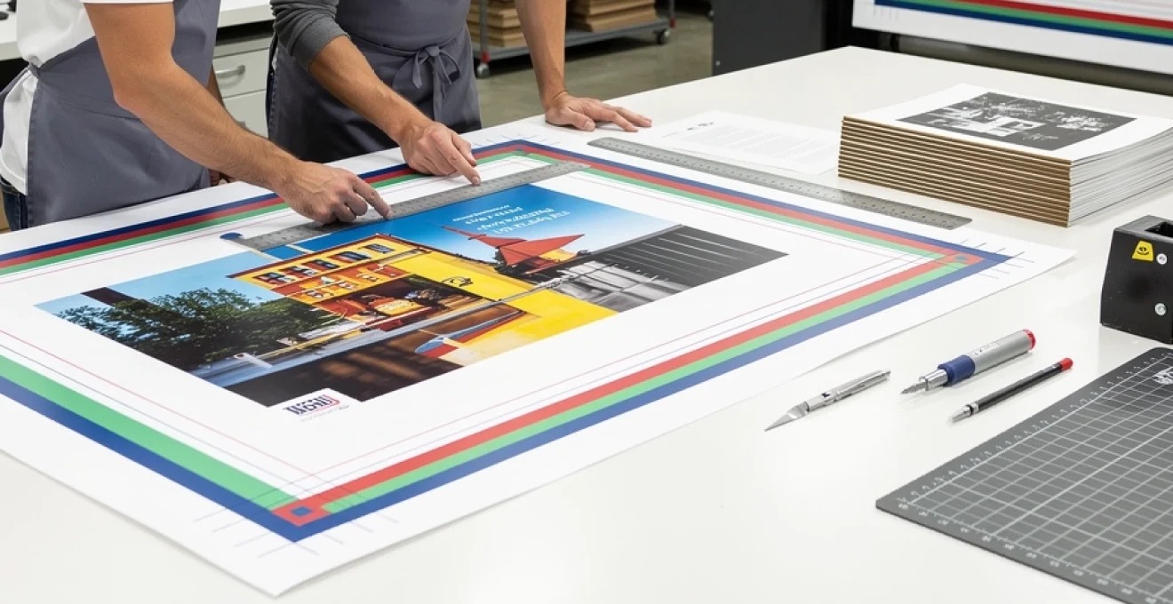
Trim marks and cutting specifications for commercial printing
Trim marks translate your digital layout into precise physical dimensions on press sheets. They show finishing operators exactly where the printed piece should be cut to achieve the specified trim size. While bleed gives cutters a “buffer zone”, trim marks act like coordinates on a map, ensuring that every business card, brochure, and book page is cut consistently across the run.
Commercial printers typically impose multiple copies of your design onto larger parent sheets to maximise efficiency and reduce waste. Trim marks on the imposed sheet define how those pieces will be sliced and separated, often through several passes on a guillotine or automated cutter. When you supply artwork with accurate trim marks that align with your declared finished size, you help the printer maintain tight tolerances and minimise variation from piece to piece.
Corner trim marks vs centre trim marks positioning
Most designers are familiar with corner trim marks: short lines that appear just outside each corner of the artwork, indicating where the finished page should be cut. These are the default style in applications like InDesign and Illustrator, and they are especially useful when a single design is positioned on a sheet. Corner marks define both horizontal and vertical cut positions and help operators see at a glance if the image is aligned correctly on the cutting bed.
Centre trim marks, by contrast, appear along the midpoints of each edge rather than at the corners. These marks are frequently used in complex impositions, multi-up layouts, and folded pieces where intermediate cuts are needed before final trimming. Centre marks can also assist with aligning folding plates and scoring rules, especially on larger formats such as A2 posters or folded leaflets where the precise centre line is critical.
In practice, commercial printers often use a combination of corner trim marks and centre marks depending on the finishing sequence and equipment. As a designer, your key responsibility is to ensure that any marks you include are generated by your design software’s native functions, are placed outside the bleed area, and do not overlap with the live design. Avoid manually drawing your own crop marks with strokes, as these can end up inside the trim area and appear on the final product.
Guillotine cutting tolerances and finishing accuracy
Even the most advanced guillotine cutters and finishing lines operate within defined tolerances rather than absolute perfection. Typical cutting tolerances in commercial print range from ±0.5mm on highly calibrated systems to around ±2mm on older or heavily used equipment, particularly when cutting thick stacks or textured substrates. This margin of error is precisely why bleed and safety margins are non-negotiable for professional results.
Guillotine cutting accuracy is influenced by several variables: paper grain direction, stock thickness, clamp pressure, and environmental factors like humidity. For example, a 350gsm board behaves very differently under the blade compared to an 80gsm text stock, often requiring lower lift heights and more careful jogging to maintain alignment. When your design allows for these realities—through adequate bleed, sensible margins, and consistent trim marks—you reduce the risk of visible shifts between pages or between items in a multi-up layout.
Understanding cutting tolerances also informs design decisions such as border thickness and edge-aligned elements. Hairline borders positioned close to the trim can quickly reveal even the slightest misalignment, producing visibly uneven edges. If you must use borders, keep them thick enough to disguise minor shifts, or pull them well inside the safety margin so that any cut variation does not become visually distracting.
Die-cutting registration and custom shape trimming
When a project moves beyond straight edges into custom shapes—think rounded business cards, packaging, swing tags, or windowed folders—die-cutting becomes the primary finishing method. A die is a custom-made cutting tool that acts much like a cookie cutter, pressing through the printed sheet to create consistent shapes. For this process to work perfectly, your artwork must register accurately with the die layout supplied or approved by the printer.
Die-cutting registration tolerances are typically a little looser than straight guillotine cuts, often in the region of ±0.5mm to ±1mm. As a result, bleed and safety margins around die-cut edges are even more critical. Background colours and images should extend beyond the die line into the bleed area, while text and logos must stay a safe distance inside the live area so that minor registration shifts do not clip important content.
Most printers will provide a die line template as a separate layer or file, which you should place on a dedicated non-printing layer in your layout. Keep this die line in a spot colour with overprint enabled, and never convert it to part of the artwork itself. By maintaining a clear separation between artwork and cutting information, you allow pre-press teams to handle die-making and registration accurately without risking accidental printing of the die outline.
Perfect binding and saddle stitching trim considerations
Multi-page documents such as magazines, catalogues, and books introduce additional trim considerations due to binding methods. In saddle-stitched publications (where folded sections are nested and stapled along the fold), the inner pages tend to “creep” outward slightly as more pages are added. To compensate, pre-press technicians adjust the page positions so that trim lines still produce clean edges, but this means artwork that sits too close to the fore-edge can shift unpredictably.
Perfect-bound books, where pages are glued into a spine and then trimmed on three sides, require special attention to both inside (gutter) margins and outer trim. The spine side must allow enough margin so that text does not disappear into the binding, especially in thicker books with higher page counts. At the same time, the head, foot, and fore-edge trims must respect standard tolerances so that page numbers and running headers align consistently across the block.
As a rule, always follow your printer’s binding-specific margin recommendations and avoid running critical content right up to the trim on bound edges. For covers, remember that wrap-around artwork spans the front, spine, and back, with bleed extending beyond all outer edges. Minor trimming variations from copy to copy are inevitable, so designing with generous safety margins ensures that titles, author names, and key imagery remain centred and readable regardless of binding and trim shifts.
Safety margins and live area calculations
If bleed protects your design from the outside, safety margins protect it from the inside. The safety margin—often referred to as the live area—is the buffer zone inside the trim line where all essential content must reside. By keeping text, logos, and key visual elements within this live area, you safeguard them from being clipped or appearing uncomfortably close to the edge after trimming.
In standard commercial printing, a common recommendation is to maintain at least 3mm to 5mm of safety margin inside the trim edge for small items such as business cards or postcards. For larger pieces such as A4 brochures or magazines, designers often adopt 10mm to 15mm margins to create visually balanced layouts and account for potential cutting tolerances. For books and bound documents, inside gutter margins increase further to compensate for binding and page thickness.
How do you calculate an appropriate live area? Start with your finished trim size and subtract the desired margin from each edge. For example, an A5 flyer measuring 148mm × 210mm with 10mm safety margins will have a live area of 128mm × 190mm. All vital content should fit within this inner rectangle, while backgrounds and decorative elements can extend outward into the bleed. Thinking of the page as a framed picture—with the frame representing your margin—helps ensure that nothing important ends up half-hidden by the “frame” of the trim.
Digital publishing platforms and print-on-demand services such as book self-publishing portals often publish detailed margin calculators based on page count and trim size. Their guidelines typically specify minimum gutter margins that increase with thickness, while outside margins remain relatively constant. Whenever you design for a specific platform or printer, always cross-check your live area calculations against their published specifications to avoid file rejections or unexpected layout shifts in automated pre-flight checks.
Pre-press file preparation and print-ready specifications
The step between a beautifully designed file and a successful print run is pre-press preparation. This process converts your layout into a print-ready format that aligns with the technical capabilities of the press, platesetters, and finishing equipment. Neglecting pre-press basics—such as bleed, trim, resolution, and colour mode—is one of the most common reasons for delays, reproofs, or substandard print quality.
Most commercial printers prefer press-ready PDFs exported to industry standards such as PDF/X-1a or PDF/X-4. These standards ensure that fonts are embedded, colours are correctly defined, and transparency is handled predictably. When exporting, you should always include the correct bleed area, add trim marks if requested, and ensure that the PDF page size reflects the bleed-inclusive dimensions rather than just the final trim.
Resolution is another critical component of print-ready specifications. For high-quality litho and digital printing, raster images should generally be supplied at 300 dpi at final size, while large format printing can often accept 150 dpi at full dimensions because the viewing distance is greater. Upscaling low-resolution images in layout software does not truly increase their quality; instead, you should start with sufficiently large source files or consider alternative imagery if the originals cannot support the required print size.
Colour management plays a central role in ensuring that what you see on screen approximates what appears on paper. Professional print workflows rely on CMYK colour spaces and, in many regions, standardised profiles such as FOGRA39 or GRACoL. Before exporting, convert RGB images to CMYK, avoid using registration black for text, and check that spot colours (such as Pantone inks) are correctly defined where required. A calibrated monitor and soft-proofing against the printer’s ICC profile can further reduce surprises at press.
Finally, simple housekeeping steps make pre-press far smoother: remove unused swatches and layers, outline or embed fonts when requested, and ensure that all linked images are up to date and included in your package. Many designers treat pre-press like packing a suitcase before a long trip—taking a few extra minutes to check every item prevents far larger problems once the job has left your hands and is on its way to press.
Quality control measures for print production accuracy
Even with meticulous file preparation, consistent print precision depends on robust quality control throughout production. Professional printers implement multiple checkpoints—both automated and manual—to verify that bleed, trim, and margins are respected at every stage. These checks begin with pre-flight software that scans incoming PDFs for common issues such as missing bleeds, low-resolution images, and incorrect colour spaces.
Once files pass pre-flight, proofing becomes the next line of defence. Soft proofs (on-screen PDFs) allow you to check layout, pagination, and margins, while hard-copy proofs or contract proofs provide a physical reference for colour, sharpness, and trim positioning. For colour-critical work, many print buyers still request calibrated proofs on representative stock so they can sign off knowing what the final run should match.
On press, operators use registration marks, colour bars, and trim guides to monitor alignment and colour consistency across the sheet. Periodic pulls from the press are checked against approved proofs, and adjustments are made to ink density, registration, and cutting alignment as needed. In finishing, sampling continues: stacks are checked for even trimming, square corners, and correct folds, with any deviations flagged before the full run is completed.
As a client or designer, you can contribute to effective quality control by providing clear, technically sound artwork and by communicating any non-standard expectations early. Requesting and carefully reviewing proofs, especially for new formats or high-value campaigns, is one of the most powerful tools you have to catch issues before they become expensive mistakes. In a production environment where thousands of sheets can run through a press every hour, the combination of well-prepared files and disciplined quality control is what ultimately delivers the razor-sharp bleed, accurate trim, and comfortable margins that define true print precision.