Colour consistency across multiple print runs remains one of the most challenging aspects of commercial printing operations. When brands invest significant resources in developing their visual identity, even minor colour variations can undermine their professional image and customer trust. The complexity of achieving perfect colour reproduction stems from numerous variables including substrate characteristics, environmental conditions, ink formulations, and equipment variations. Modern printing facilities must implement comprehensive colour management systems that address each of these factors systematically. The stakes are particularly high in today’s competitive marketplace, where consumers have become increasingly discerning about visual quality and brand authenticity.
Understanding colour management systems in commercial printing operations
Commercial printing colour management systems serve as the backbone for maintaining consistent output across diverse production environments. These sophisticated frameworks integrate hardware calibration, software protocols, and standardised measurement techniques to create repeatable colour reproduction workflows. The foundation of any effective colour management system rests on understanding how different components interact within the printing process, from digital file preparation through final substrate application.
Modern colour management systems utilise device-independent colour spaces to translate colour information accurately between different stages of production. This approach eliminates the guesswork traditionally associated with colour matching, replacing subjective visual assessments with precise mathematical calculations. The implementation of such systems requires substantial initial investment in both technology and staff training, yet the long-term benefits include reduced waste, improved customer satisfaction, and enhanced operational efficiency.
ICC profile implementation for Press-to-Press consistency
ICC profiles represent the cornerstone of modern colour management, providing standardised methods for describing how devices reproduce colour. These mathematical descriptions enable accurate colour translation between different printing presses, even when using identical ink and substrate combinations. Proper ICC profile implementation requires regular calibration schedules and systematic documentation of press characteristics under various operating conditions.
The creation of custom ICC profiles for each press configuration ensures optimal colour reproduction for specific substrate and ink combinations. This process involves printing standardised test targets and measuring the resulting colours using calibrated spectrophotometers. The data collected during this process creates a unique fingerprint for each press setup, enabling precise colour prediction and adjustment throughout production runs.
Pantone matching system integration with digital colour standards
Integrating Pantone colour standards with digital workflows presents unique challenges that require careful consideration of colour gamut limitations and substrate interactions. The Pantone Matching System provides a universal language for colour communication, yet achieving accurate reproduction on different substrates often requires custom ink formulations and precise press adjustments. Successful integration demands understanding the relationship between spot colour specifications and process colour approximations.
Modern colour management software enables automatic conversion between Pantone specifications and achievable press colours, accounting for substrate characteristics and ink limitations. This technology significantly reduces the time required for colour matching while improving accuracy and repeatability. However, operators must understand when manual intervention becomes necessary to achieve optimal results for challenging colour combinations.
CIE lab colour space calibration protocols
The CIE Lab colour space provides device-independent colour measurement that forms the foundation for accurate colour communication across different printing systems. This three-dimensional colour model separates luminance from chromaticity, enabling precise colour adjustments without affecting other colour characteristics. Implementing CIE Lab calibration protocols requires systematic measurement procedures and regular validation of spectrophotometer accuracy.
Establishing tolerance limits within the CIE Lab colour space enables objective quality control decisions based on measurable colour differences. Delta E calculations provide numerical values that correlate with visual colour perception, allowing operators to make informed decisions about colour acceptability. Most commercial printing operations establish Delta E tolerances between 2.0 and 4.0, depending on the application requirements and customer expectations.
G7 master qualification standards for print uniformity
G7 Master qualification represents the industry gold standard for achieving print uniformity across different printing processes and substrates. This comprehensive methodology focuses on achieving neutral grey balance and consistent tone reproduction rather than simply matching specific colour values. The G7 approach recognises that achieving perfect colour matching requires fundamental control over basic printing parameters including dot gain, grey balance, and solid ink density.
Implementation of G7 standards requires systematic measurement and adjustment of printing parameters to achieve specified grey balance targets. This process involves regular measurement of printed control strips and adjustment of press parameters to maintain consistency over time. The benefits of G7 implementation extend beyond colour consistency to
improved make-ready times, reduced waste sheets, and more predictable results when moving jobs between presses or locations. For brands that require strict colour consistency across packaging, marketing collateral and point-of-sale materials, G7 compliance becomes a powerful competitive advantage. By aligning print conditions with a recognised industry standard, print providers can offer better colour predictability from the first approved proof to subsequent repeat runs, even years later.
From an operational perspective, G7 Master qualification also streamlines communication between print buyers, pre-press teams and press operators. Instead of relying on subjective descriptions like “a bit warmer” or “slightly darker,” stakeholders can reference objective grey balance and tonality metrics. This common language reduces the risk of miscommunication, speeds up colour approvals, and creates a robust framework for continuous process control across the entire printing workflow.
Pre-press colour verification and quality control procedures
Effective pre-press colour verification serves as the first line of defence against colour shifts between print runs. Before a single sheet goes on press, artwork, profiles, and press conditions must be aligned to achieve predictable, consistent print colour. In practice, this means standardising how files are prepared, how proofing devices are calibrated, and how measurement data is captured and interpreted.
By implementing clear pre-press colour management procedures, you reduce the likelihood of late-stage surprises on press where corrections are more costly and time-consuming. Think of pre-press as the blueprint phase in construction: if the blueprint is flawed, no amount of on-site adjustment will deliver the desired building. Similarly, when colour targets, ICC profiles and proofing standards are verified upfront, maintaining colour consistency from one print run to another becomes far more achievable.
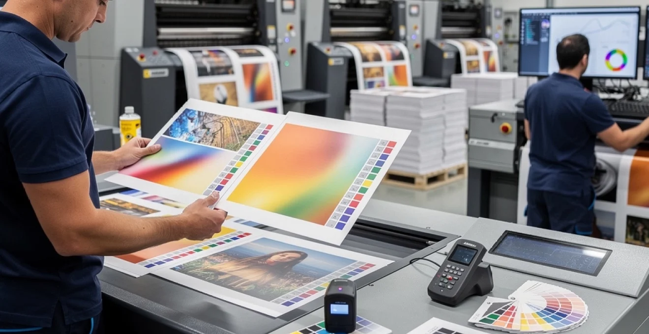
Spectrophotometer measurement techniques for substrate analysis
Spectrophotometers are indispensable tools for quantifying how different substrates affect printed colour. Even when using the same inks and profiles, coated, uncoated, and speciality materials will reflect and absorb light differently, which can cause noticeable colour variance between print runs. By measuring the substrate’s base whiteness, brightness, and hue in CIE Lab colour space, you can anticipate these shifts and compensate through profiling or press adjustments.
In a robust colour management workflow, substrate analysis typically begins with taking multiple readings across different areas of the sheet to account for manufacturing variability. These readings are averaged to create a reliable data set, which is then used to build or refine ICC profiles tailored to that particular paper or board. Much like a tailor adjusts a suit to fit a specific person, custom profiles and ink curves are adjusted to fit the “character” of each substrate, resulting in more stable print colour and fewer surprises during repeat orders.
Advanced spectrophotometer techniques also include measuring under different standard illuminants (such as D50 or D65) to evaluate how colours will appear in real-world lighting conditions. This is particularly important for packaging, where products may be viewed under retail lighting that differs from the print room environment. By understanding and documenting the substrate’s behaviour under varied lighting, print providers can set realistic expectations with clients and refine their colour strategies for long-term consistency.
Digital proofing workflows using epson SureColor and HP DesignJet systems
Digital proofing devices such as Epson SureColor and HP DesignJet printers play a critical role in predicting final print colour before production begins. When these systems are calibrated, profiled, and maintained to high standards, they provide soft and hard proofs that closely simulate the behaviour of the final production press. For commercial printers, aligning proofing colour with press colour is essential to avoid disputes and to maintain trust during repeat print runs.
A well-designed proofing workflow typically includes regular linearisation of proofing devices, periodic recalibration to account for head wear and ink batch changes, and the use of device-specific ICC profiles that reflect production press conditions. You might, for instance, build proofing profiles that emulate a sheetfed offset press printing on gloss coated stock with a particular total ink limit. By closing the gap between proofing and production environments, you reduce the risk that approved proofs will diverge from the final output when the job is reprinted months later.
To keep colour consistent across both Epson SureColor and HP DesignJet systems, many shops implement centralised colour servers or RIP software that handles all profile assignments and rendering intents. This centralised approach acts like an “air traffic control” system for colour management, ensuring that every incoming job follows the same path from digital file to printed proof. As a result, designers, print buyers and press operators can have greater confidence that an approved digital proof will remain a reliable reference for subsequent print runs.
Colour bar implementation and delta E tolerance monitoring
Colour bars printed on every press sheet function as real-time diagnostic tools for monitoring print colour consistency. These control strips typically include solid patches, tints, overprints, and grey balance targets that are measured using a spectrophotometer or scanning bar. By evaluating Delta E values between these patches and the target values, operators can quickly determine whether the press is still running within acceptable colour tolerances.
Establishing clear Delta E tolerance ranges—often between 1.0 and 3.0 for critical brand colours and slightly higher for general images—enables objective decisions about when a press adjustment is necessary. Rather than relying on the naked eye, which may be affected by fatigue or lighting changes, operators use measured data to correct density, ink-water balance, or colour curves. Over time, this disciplined use of colour bars becomes a powerful tool for keeping colours consistent across multiple print runs and across different presses.
From a quality management perspective, consistent Delta E tracking also supports long-term trend analysis. By logging measurement data from each run, you can identify patterns such as specific inks drifting out of spec, particular substrates causing greater variability, or environmental conditions affecting print stability. Armed with this insight, print managers can implement targeted improvements to processes, materials, or equipment, further tightening control over repeatable print colour.
Press sheet approval protocols and documentation standards
Press sheet approval protocols formalise the moment when a trial sheet transitions into the production standard. During a make-ready, the press operator, pre-press specialist, and often the client or account manager review a candidate sheet under standardised lighting conditions such as D50 viewing booths. Once the sheet meets agreed colour, registration, and density criteria—often verified against the proof and numerical targets—it is signed, dated, and retained as the “OK sheet.”
This approved press sheet becomes a physical benchmark for subsequent adjustments during that run, and crucially, for future reprints. By storing OK sheets along with recorded data such as ink series, substrate lot numbers, press settings, and Delta E readings, you create a comprehensive production dossier. When the job returns in six months, the new run can be aligned not only to the digital file but also to the original OK sheet and associated metrics, dramatically improving colour consistency between runs.
Robust documentation standards also streamline communication with brand owners who may have strict colour guidelines. Instead of subjective arguments over whether a reprint “looks different,” you can present measured evidence, historical data, and physical references to demonstrate compliance or identify root causes of variation. This level of transparency builds confidence and positions your operation as a reliable partner for long-term, colour-critical work.
Press room environmental controls and ink management
Even the most sophisticated colour management workflow can be undermined if press room environmental conditions and ink management practices are not tightly controlled. Temperature, humidity, and air quality all influence how ink transfers, dries, and ultimately appears on the substrate. Likewise, variations in ink viscosity, ageing, and batch-to-batch consistency can introduce subtle but cumulative colour shifts between print runs.
In an ideal commercial printing environment, temperature is maintained within a narrow range (often 20–24°C / 68–75°F) and relative humidity around 45–55%. These conditions help stabilise paper moisture content and ink behaviour, reducing issues such as curl, waviness, or inconsistent dot gain. Monitoring systems that log environmental data throughout the day provide valuable context when troubleshooting colour variation; if a particular run coincided with a spike in humidity, the data will reveal it.
Ink management is equally critical for maintaining consistent colour from run to run. Best practices include rotating stock to avoid using aged ink, thoroughly mixing inks before use to homogenise pigments, and documenting which ink batches were used on each job. Many operations also work closely with ink manufacturers to specify tight tolerances on colour strength and rheology, ensuring each delivery behaves as close as possible to the previous one. In effect, you are treating ink like a precision chemical rather than a commodity, which is essential for high-end brand work.
To further stabilise outcomes, some print shops employ closed-loop colour control systems that measure colour on press and automatically adjust ink keys or colour curves in real time. These systems act like a cruise control for colour, compensating for minor fluctuations in ink, substrate, or press conditions that would otherwise accumulate over longer runs. When combined with disciplined environmental controls and meticulous ink handling, they greatly increase the likelihood that a second or third print run will visually match the first.
Advanced colour matching technologies and software solutions
As customer expectations for colour accuracy rise, advanced colour matching technologies and specialised software have become essential tools for commercial printers. These solutions go beyond basic ICC profiling to offer predictive simulations, centralised colour libraries, and automated adjustment routines that minimise human error. When properly integrated, they act as a digital backbone that keeps colour behaviour consistent across devices, substrates, and time.
Modern colour management ecosystems often combine high-precision measurement devices with powerful software platforms that analyse, store, and apply colour data across the entire workflow. For instance, a spectrophotometer reading taken on press can feed into a colour server that updates curves used by both digital presses and proofing devices. This interconnected approach transforms colour management from a series of isolated steps into a coordinated, data-driven system, improving repeatability between print runs.
X-rite i1pro spectrophotometer integration with PrintShop pro
The X-Rite i1Pro spectrophotometer is widely recognised for its accuracy and versatility in measuring colour across a broad range of substrates and print conditions. When integrated with production management platforms such as PrintShop Pro, it becomes a powerful engine for automating routine colour control tasks. Instead of manually transferring readings or relying on ad-hoc spreadsheets, measurement data flows directly into the software environment where it can be analysed and applied consistently.
In a typical workflow, colour targets, profiles, and press conditions are defined within PrintShop Pro, while the i1Pro provides the real-world readings needed to validate and optimise those settings. For example, you might measure a colour bar on a calibration sheet, and the system would automatically calculate required curve adjustments to bring output back into tolerance. Over time, the software can track performance trends, alert operators to deviations, and help schedule maintenance or recalibration before colour issues become visible to the customer.
This level of integration not only increases accuracy but also accelerates make-ready times and standardises procedures across shifts and operators. New staff can follow guided routines within PrintShop Pro while the i1Pro supplies reliable measurement data, reducing reliance on individual experience. The result is a more predictable print colour environment, where every run benefits from a shared, well-documented colour management framework.
Heidelberg prinect colour toolbox automation features
Heidelberg’s Prinect Colour Toolbox is designed to bring advanced colour science directly into the heart of offset and digital press operations. Its automation features simplify complex tasks such as profile creation, curve optimisation, and grey balance calibration, making it easier to maintain consistent colour from one print run to another. Instead of building and adjusting profiles manually, users can rely on guided workflows that translate measurement data into actionable adjustments.
One of the key strengths of Prinect Colour Toolbox is its ability to link pre-press and press settings through a unified colour strategy. Profiles created based on press measurements can be applied directly within RIPs and workflows, ensuring that screens, plates, and presses all “speak the same colour language.” This reduces the gap between what you see in pre-press and what appears on paper, lowering the risk of last-minute corrections during reprints.
Automation also helps maintain consistency over time as consumables, substrates, and environmental conditions evolve. Scheduled recalibration routines, automatic curve updates, and integrated reporting keep your colour infrastructure aligned with real-world performance. In practice, this means that a job printed today can be reprinted months later with much greater confidence that the colours will align closely with the original approved run.
Colorlogic CoPrA profiling software for multi-substrate applications
ColorLogic CoPrA is a specialist profiling solution well-suited for printers who handle a diverse mix of substrates, from standard coated papers to synthetics, labels, and packaging films. Because each material type reflects colour differently, relying on a single generic profile can lead to noticeable shifts when switching substrates or repeating jobs on alternative stocks. CoPrA addresses this challenge by enabling the creation of precise, substrate-specific profiles and device link profiles that maintain colour intent across varied conditions.
In practice, a printer might use CoPrA to build dedicated profiles for a range of commonly used materials, capturing the unique behaviour of each substrate in CIE Lab terms. These profiles can then be used to convert colours intelligently, preserving brand-critical hues and neutral tones while respecting total ink limits and drying constraints. Device link profiles are particularly valuable for maintaining separation characteristics and black usage during conversions, which in turn supports consistent print colour and stable grey balance between runs.
For operations managing both offset and digital devices, CoPrA can also serve as a bridge that aligns output between technologies. By harmonising colour response across multiple presses and substrates, it becomes easier to move jobs between devices without compromising brand appearance. This flexibility not only improves production efficiency but also safeguards the visual continuity of campaigns that may span several print technologies and materials.
Troubleshooting common colour variation issues between print runs
Despite best efforts, colour variations between print runs will occasionally occur, and having a structured troubleshooting approach is essential. The key is to move from guesswork to diagnosis, using measurement data, documentation, and process knowledge to pinpoint root causes. Is the shift related to ink, substrate, press settings, or pre-press files? Asking the right questions and following a consistent checklist helps narrow the field quickly.
A practical starting point is to compare the current run’s sheets to the original OK sheet and proof under standardised lighting. Visual differences should then be quantified with Delta E measurements on brand colours, neutrals, and key image areas. If Delta E values exceed established tolerances, checking environmental logs, ink batch records, and maintenance histories often reveals patterns—such as a change in paper supplier or a lapse in calibration schedules—that explain the variance. By treating each incident as a learning opportunity, you can refine procedures and reduce the likelihood of repeat issues.
Some of the most frequent root causes include incorrect or outdated ICC profiles, uncalibrated proofing devices, changes in paper whiteness, and unrecorded adjustments made during previous runs. Addressing these requires a mix of technical fixes and cultural change: operators should be encouraged to document changes, follow standard operating procedures, and escalate anomalies early. Over time, this disciplined approach turns colour troubleshooting from a reactive firefight into a controlled, data-driven process that preserves brand consistency.
Quality assurance documentation and colour standard maintenance
Long-term colour consistency relies on more than technology; it also depends on rigorous quality assurance documentation and the ongoing maintenance of colour standards. Without accurate records of profiles, press conditions, ink batches, and approved references, reproducing a job months or years later becomes largely a matter of luck. By contrast, when every critical variable is logged and easy to retrieve, you can reconstruct the conditions of a successful run and align new production to that benchmark.
Many commercial printers establish centralised colour standard libraries that include digital assets (such as ICC profiles and CxF data for brand colours) alongside physical references like swatch books and OK sheets. These libraries are maintained under controlled conditions and updated whenever process changes, new substrates, or press upgrades occur. Think of them as the “source of truth” for your colour ecosystem: if a question arises about how a brand colour should look, the answer resides there, supported by both data and tangible samples.
Regular review cycles are also important for keeping colour standards relevant and effective. Scheduled audits might include re-measuring key references, verifying that all devices are calibrated to current targets, and confirming that documented tolerances still align with customer expectations. By approaching colour standard maintenance as an ongoing process rather than a one-time project, you create a stable foundation that supports consistent print colour across countless future runs. The investment in documentation and maintenance may seem modest compared to the cost of brand damage from inconsistent colour—and over time, it pays for itself many times over.